There is no denying the fact that beverages are loved by adults and children alike as they help us energize and rejuvenate. No wonder that children feel the same about them. At home, in school, while playing and when out and about, children consume just as many beverages as adults – if not more.
These drinks can range from flavored water to soft drinks. There are a number of beverages in the market targeting the younger audience. And in the competitive market, the beverage companies feel the need to stay ahead of the game by forming a solid brand identity. One way of doing this is through logo design.
Ever wondered why there is a need to introduce a beverage logos ? Well, here is a fact that will leave you surprised:
According to a study conducted on kids aged 3-5 found that 80 per cent of the kids were able to recognize brand logos even when they were not able to read. The surprising fact was that the children’s product preferences were strictly based on brands’ image. This means that a beverage logo design should specifically take into account the children, while simultaneously appealing to the adults. However, this is easier said than done as designing for children keeping their taste in view involves an understanding of child psychology and is rather a very different than designing a logo for adults. Here are some tips to help beverage companies to come up with a timeless beverage logo to appeal to kids and adults alike.
Tips For Designing Beverage Logo
1. Typography
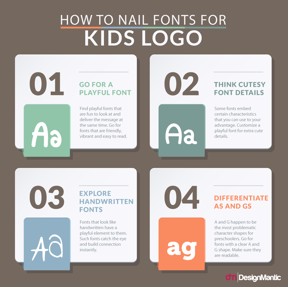
Designing a logo for children’s beverages can be fun because you get to choose from the set of playful fonts that are off limit for the more serious corporate logos. As far as choosing an appropriate font for a kids logo goes, there is no hard and fast rule. Any font that feels good with your tagline and text is okay. However, just to get you started, here are some things to keep in mind:
- Go for a Cute and Playful Font:
- Always Ensure Readability.
- Go for Cute Details and Styles
Aim for a friendly, trustworthy font that makes kids feel warm and secure.
Even if a part of your target audience is too young to read, go for a font that sticks with them easily, the one they can easily recognize in later stages.
The key is to pick out details kids can relate with. Focusing on font styles that mimic kids’ handwriting or other quirky details can attract your young audience and make the image stick in their heads.
2. Colors
The children’s beverage logo design should be color specific. For once, your color choice should depict the kind of beverage your company makes, and for another, the color should also draw children’s attention. Hot and cold beverages, sports drinks and milk-based drinks use different kinds of colors. For example, sports drinks use neon shades to depict the kind of energy they supply. Similarly, milk-based drinks refer towards milky colors and creamy textures. Your goal should be to first go deep into the color that suits the needs of your beverage niche. Picking a specific shade would come in later part of the process. Here is a quick reference sheet to help you select the colors according to the mood of your target audience.
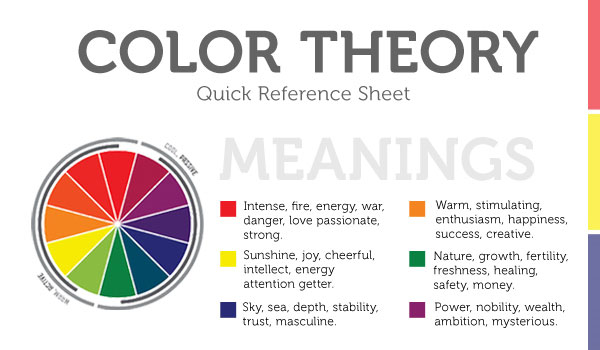
Image: ReadyArtWork
Yellow and orange rank as the top attention grabbing colors for children logo and design. This is also because yellow and orange are known for their high frequency, ones one can spot from far. Children, being the distracted individuals, especially benefit from a color branding that implies deep shades of yellows and oranges. On top of that, both colors also signify friendliness and cheerfulness.
Related: The 10 Commandments of Color Theory
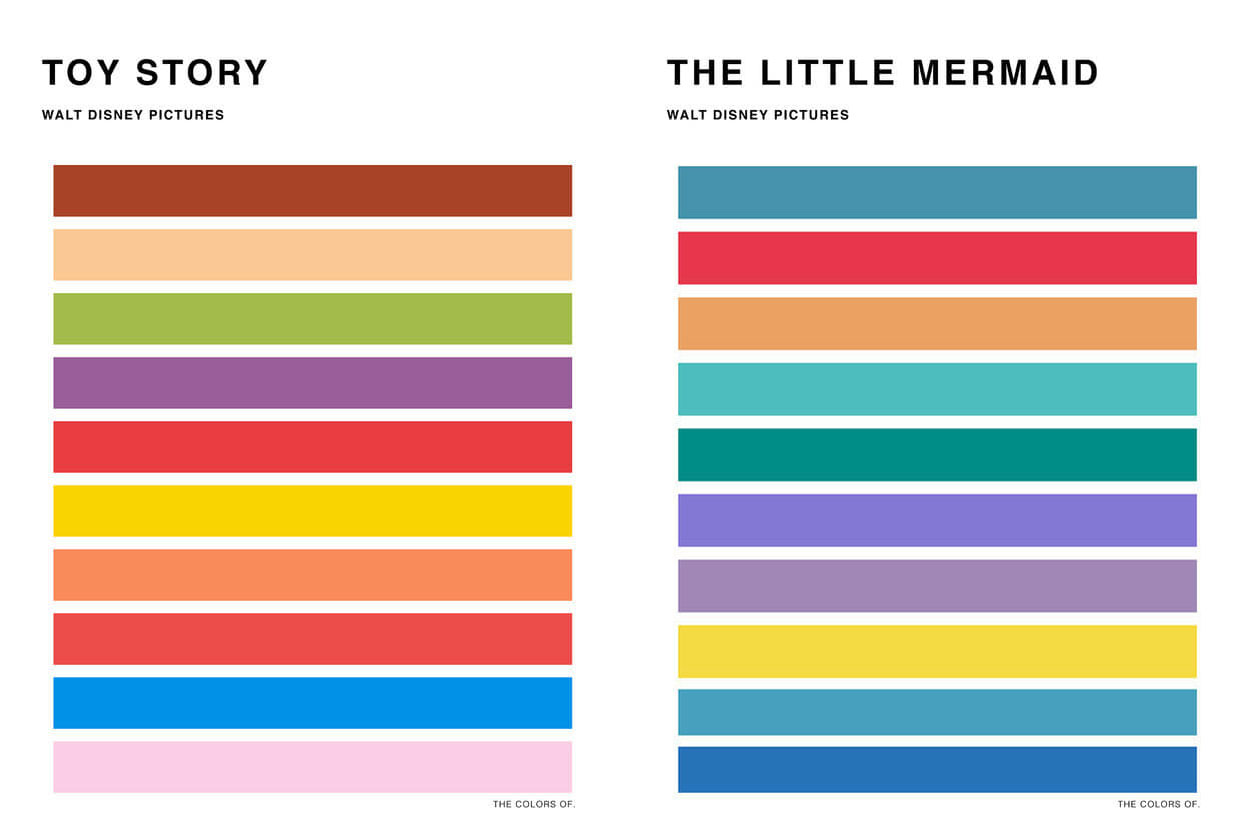
Another way to extract great color schemes for kids’ logos is by using color schemes found in popular kids’ literature or cartoons. The combinations will trigger subconscious association that can be used to your advantage. Some great color schemes for kids’ drink logos can be these:
3. Symbols & Characters
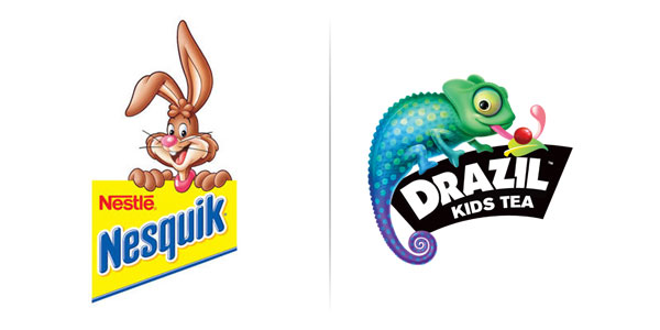
Imagine if your flavored milk logo has a nice little bunny next to it? Like the famous Nesquik logo that features the character Quicky. While text based logos are great, logos with symbols and characters are especially memorable for children. This is because children create strong associations with certain characters and images, and seeing them in the logo can make the logo stand out. If you want your beverage logo to be recognizable, try going for special characters or symbols. If you do choose to go down this route with your beverage logo, here are some facts to keep in mind:
- Animal Figures Rank at The Top: 59% of logos with animal figures are more attention grabbing for kids than those with some other characters. This is because children are naturally interested in animals. They like to pat them, know about them, read about them and watch TV shows that feature animated cartoons.
- Images with Kids Come Next: Naturally! Kids are most interested in other kids. Also, seeing a cartoon character on a logo immediately makes children realize the product is targeted at them. Not only does a kid logo make them feel special, it grabs their attention, and they just want it.
- Commonly Recognizable Geometrical Shapes: Easily recognizable geometrical shapes and figures like circles, triangles, hearts, and flowers rank the third. This is because while these objects are recognizable, they seldom feel personalized to kids.
- Abstract Shapes: Using abstract shapes in kids’ logos can be very tricky. This is because children find it hard to relate or recognize abstract shapes. It is always better to go for concrete figures and symbols when marketing kids’ products, however with the expert use of colors and fonts, even an abstract logo can hit the nerve! Like this one:
Animal figure logos are also a great way for parents to market the drink to a child. Children start seeing the figure as a mascot, and can be persuaded to consume the drink endorsed by the mascot.
So unless you are going for a customized typeface that just sits with kids in the most impressionable way, using these shapes to bring a unique identity might be difficult. However, Walls Ice-cream has done it! (Even if it’s not a beverage company, it is a classic example of a food company logo that caters to children, as well as adults, and sticks to their minds!)
Logos For Different Kids’ Beverage Types
There are many different kinds of drinks that are marketed to target children. Good beverage logos cater to children and parents alike. Here are some examples of great logos from different categories that not only managed to make a great, memorable visual but also a memorable logo design.
1. Plain or Flavored Water
Bottled water companies often market a specific product range for children. These bottled waters have the perfect pH and minerals combination needed for children. If you are such a company, make sure your intent stands out loud and clear. Use blues to refer to the refreshing, clear water you market. Rounded letters provide a friendly font for the kids and a slightly off orientation of the characters gives the logo a fun and moving look!
How To Create Animated Logos? Find Out Here
If you are designing for a flavored water brand, adding special colored elements with your basic logo can be helpful. For example a slice of lemon logo, a leaf of mint etc. can be used to show the kind of flavors you make.
2. Fresh or Flavored milk
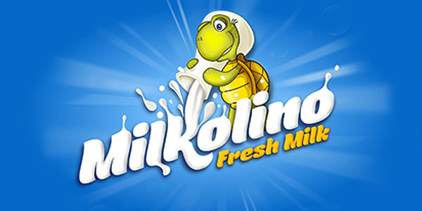
Use of whites refers clearly to the beverage type –milk! While the creamy-droplets-effect denotes the freshness of the beverage. And what can make it more memorable than an animal mascot figure! Not only can this animal character be shown in different postures, it is also a great element for making a dynamic logo set.
3. Soft Drinks
Kool Aid is perhaps the most famous children’s soft drink. It has been consumed for decades by kids and adults alike. Kool Aid forms a strong brand identity with their logo; this is why their logo has not changed much over the years. Kool Aid keeps their logo neutral in blues and whites – there is great wisdom in this. This is to make the drink icons very versatile. The neutral colors enable them to use the logo with the Kool Aid character to depict different flavors.
4. Juices
Did you know there are certain health standards that are denoted by particular colors? For instance, just as green refers to eco-friendly, yellow-orange refers to all-natural practices and values. Sunny Delight uses this concept perfectly in the logo. The blue gives a refreshing feeling to the logo and the yellow-orange adds the cheerful energy that attracts the kids. However, the yellow-orange here is another reference to Sunny Delight’s all-natural values. The drink claims to use no artificial flavors, and they make sure that the parents know this!
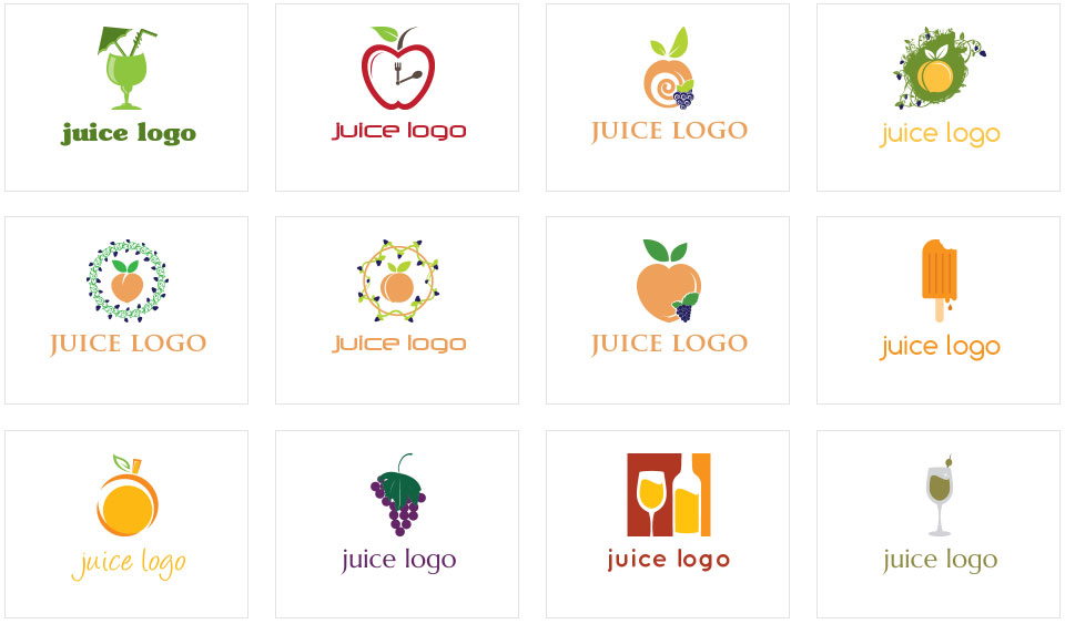
When designing logo for fruit juices, use specific fruit colors to denote your product range. For instance, in this case, Sunny Delight also uses yellow to refer to their citrus fruit flavor.
5. Nutritional Drinks
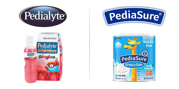
Another specific kind of kids’ drinks includes nutritional drinks. These beverages are used to fill in the nutritional gaps and are usually recommended by doctors. Pedialyte and PediaSure are two such companies that make nutritional drinks for kids and adults. This is why they keep a basic logo in blue and white. Blue signifies trust and dependability; this is why it is often used in health products. The basic logo utilizes a readable font that is easy for the kids to read as well. And when marketing their products to children, Pedialyte and PediaSure just spice it up with some funny cartoon characters!
Bonus Tip: Think Responsible Marketing
Designing a logo for kids’ products is a fun and challenging task. While there is a lot to consider, for instance specific child associations and limitations, the room for imagination and whimsical fancy is manifold in a child-targeted logo. So, if your beverage company specifically targets kids’ drinks, give the logo your best shot! However just remember to market your product in a child-friendly way. We want to create strong product and brand associations, yes, but we do not want to create addictions and blind fan following! So responsible marketing is the key!
Try Our Personalized Logo Maker Tool For:
Cocktail Logo Maker
Juice Logo Maker
Coconut Logo Template
Drink Logo Maker
Tea Logo Ideas
Milk Logo Generator
Glass Logo Maker

