A lot of people are under the impression that content is the only factor that determines conversion rate optimization. While this fact has much evidence to support it, the significance of design cannot be overlooked when it comes to boosting conversions, since the web design mistakes can sabotage the conversion rate of your website. A website optimization study revealed that fostering customer trust in online trading is much more difficult to accomplish since people cannot see your face. Thus, they make their judgment on the basis of your web design alone. Therefore, the impact of website design on your overall conversion rate cannot be unheeded.
Are your website conversion rates plummeting head down or already lower than your ever wanted them to be? Do you want to know what might be killing your leads? Could it be usability problems or simply the outcome of a poor design? Even designers employing the most cutting edge strategies can make mistakes which wreak havoc on the entire page conversion rate.
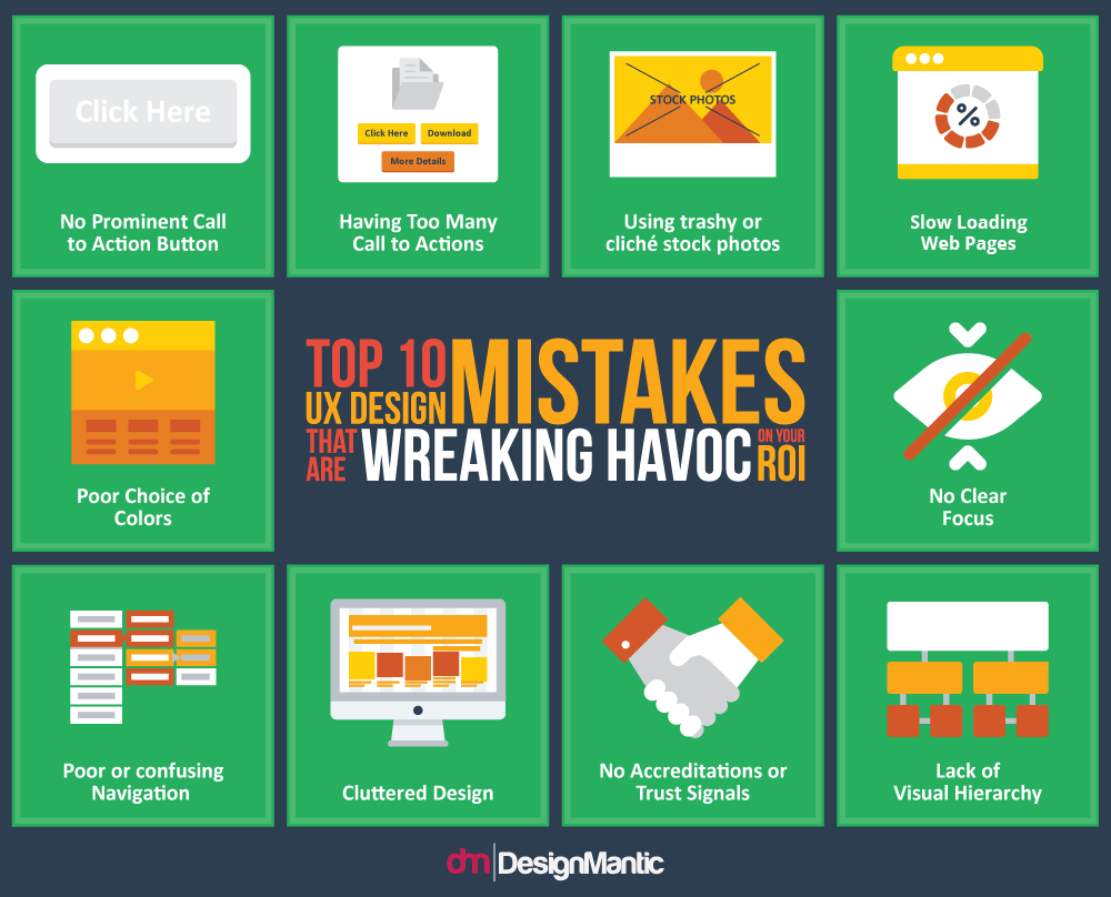
In our previous eBooks, we talked about branding and how businesses can draw attention through various brand elements. In this E-book, we aim to outline 10 top mistakes you might be making, which could kill your conversion rates, and tell you how to rectify them. Hopefully, this information on “how to do it right”, in addition to UX Design Tips to Maximize Conversion Rate, would help you get rid of the gaps in your methods:
- No Prominent Call to Action Button
- Having Too Many Call to Actions
- Using trashy or cliché stock photos
- Slow Loading Web Pages
- Poor Choice of Colors
- No Clear Focus
- Poor or confusing Navigation
- Cluttered Design
- No Accreditations or Trust Signals
- Lack of Visual Hierarchy


Hi Evan,
Amazing piece of content. I would like to share one such mistake. I started using an ad monetization network, which showed pop up ads to the visitors. But, it was an incentive-based monetization network, so basically, you get paid for app installs or user sign-ups. Revenue Hits to be precise.
A few days later, I got a message from Google Webmasters that my rankings have slipped up because they detected social engineering on my website. Had to remove those ads instantly. But luckily, I get to know about what mistake I made and learnt from it for not making it again.
I’m glad that you shared this article.
Thanks for the heads-up, Shivam!
Glad you fixed it right before it could hurt your website. Google sometimes does provide heads-up and warning but not too often. Therefore, we believe it is wise for the designers, as well as businessman running the website, to be aware of common mistakes and avoid them at all costs.
Do download the ebook and tell us what you think. Cheers!