Update 3 JAN 2020 : Check out our Logo Design Trends For 2020!
Update 31 JAN 2019 : Check out our Color Trends For 2019
Update 8 DEC 2017 : Check out our Logo Design Trends For 2018
According to a research, over 80 companies are born every hour.
Effective branding is more indispensable than ever to elevate your brand above competitors. As 2016 draws to an end, designers are looking forward to the direction logo designing will take in the next 12 months. In this regard, trends play a vital role; not only do trends inspire new and innovative ideas, they also aid designers perfect their design approach to garner attention and engagement from a new and capricious audience, and master the art of creating memorable logos that stand the test of time. While designers bid adieu and welcome trends on an on-going basis, we have accumulated logo trends which we believe will strengthen as the year runs on. Here’s the hottest logo forecast for 2017 which all budding businesses and startups need to keep an eye out for:
1. Hand-Drawn Logos
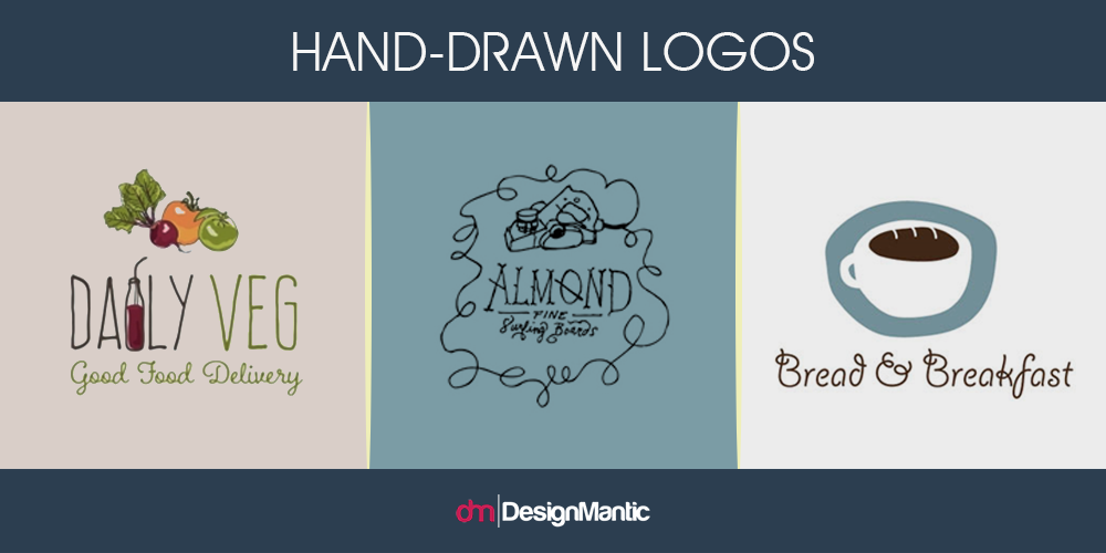
Hand-drawn logos were all the rage in 2016 and this trend is predicted to gain even more momentum in 2017 due to its ability to convey a sense of authenticity. Hand drawn custom designs are particularly suitable for the café and restaurant worlds, as they evoke feelings of creativity, independence, and freedom, a much needed reprieve from the proliferation of digital design. Hand-drawn logos emanate charisma, credibility, and warmth; three attributes which are hard to perfect using computer aided graphics. A plethora of designers and businesses are incorporating hand-drawn elements to breathe life into their brand design system. This is a technique worth delving in, if you are looking to establish a consumer brand this year. While translating the handmade design to the digital version is a tough nut to crack, the evolution of vector tracing, light pens, and scanners has made it a breeze.
Notice how the typography in the Daily veg logo matches the hand-drawn style of the accompanying illustrations, creating a down-to-earth and welcoming aesthetic. The same aesthetics can be observed across the “Almond” logo. Consider the coziness and authenticity lent to this “Bread & Breakfast” emblem through its personally drawn effect imparting a whimsical touch. A purely digital design couldn’t have captured these feelings half so well.
2. Overlapping Gradients
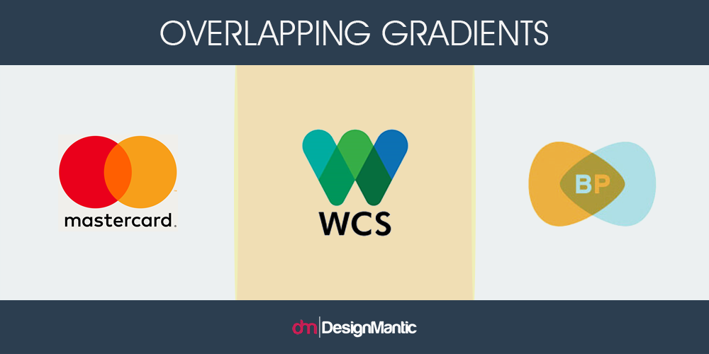
Overlapping is a relatively novel design technique and 2016 was the year of overlapping gradients. Simple geometric forms overlap to give birth to a unique and mesmerizing style. In the beginning, this technique was reserved for animal-related logos. As it gained momentum however, world’s leading companies adopted this trend. For instance, the designers from Pentagram breathed new life into the MasterCard’s logo, dropping shadows and eliminating text from the image, resulting in a memorable and clean icon. Gradients were once all about bold combinations and vibrant hues that added volume and depth. Gradients today are defined by simplicity. Designers achieve this goal by leveraging material design colors and muted hues. Given the wave of its recent popularity, we see a high potential for overlapping gradients to become a leading logo design trend in 2017.
3. Stencil Typography
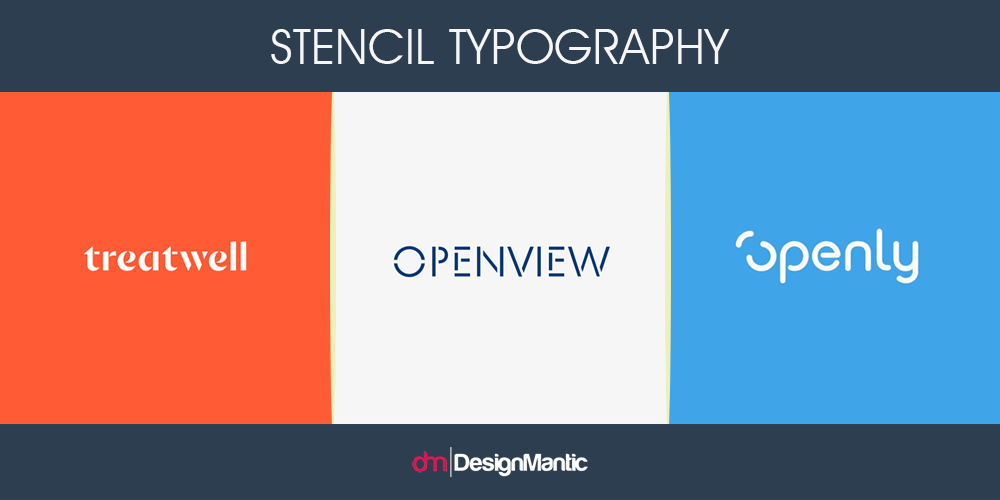
Stencil designs are great for creating visually appealing logos. Stencil fonts come in all sizes and forms, so you can always find one that suits the nature of your business to perfection. A visual hierarchy makes logos memorable and catchy, translating into the fact that versatile stencil patterns are here to make a mark in 2017, and won’t go out of style any time in the foreseeable future. For instance, in the Pentagram designed logo of Open View, the letterform “O” has been broken to visually communicate openness. Constructed of simple geometric forms, the literally open stencil font illustrates the name of the company, while also insinuating the constructive, honest, and agile brand attributes. Similarly in the logo of “Openly”, the letterform “O” has been divided to convey literal openness.
4. Geometrical Elements
While logo design has seen its fair share of geometry, big brands are only just catching on and pushing the boundaries to make this trend work in their favor. Geometric shapes are highly effective at producing unique, stylish, and responsive logos that stand the test of time. Designers are also increasingly enamored with unconventional geometric patterns. For instance, colorful polygons, both asymmetrical and symmetrical, were rampant in 2016.
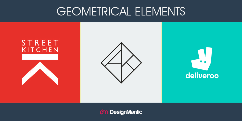
Recently, the Food delivery service Deliveroo revamped its logo to up its branding game. The original logo was primarily designed to appear across a website, delivery boxes, and business cards, but in light of a mounting user base and service, the logo needed to be tweaked to span across everything from its mobile apps, billboards, rider’s vests, and more. The new logo retains the playful “roo”, albeit with a set of clearly defined angles which the company has adopted as a design system across its entire corporate identity. The final result is modern, clean, fresh, and still fun.
You don’t need to belong to a specific industry to construct a geometric logotype, as this style is one of the most versatile design forms. Another smart idea is to leverage the geometry of your logo to give flourishes to other parts of your brand design. Use of shapes is also seen in Anna Kait’s logo and across the Charlie Smith Design logo for Street Kitchen.
5. Benders
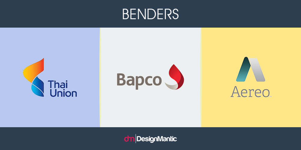
A growing fad of ambiguously twisted chards is gaining momentum a decade after the famous Moving Brands iconic Swisscom logo-in-motion. This creative era of ethereal floating symbols promises great potential in the years to come, and is every bit as conceptual and inspiring as can be expected from a logo.
While you can’t expect your consumers to intuitively comprehend the essence of an industry from a simple glimpse of the mark, you can expect the public to be so enthralled by the brash vagueness of the logo that they will be hard-pressed to delve into it more, or glean a sense of personality from your mark. Bender elements in logos help to exude an agile and flexible approach to mercurial industries. These logo designs help strengthen the claim of a brand to adjust according to the shifting needs of the market.
6. Moving Parts
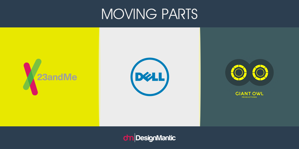
Perhaps the most enthralling trend on the horizon is branding that incorporates both logo design variation in web-based animated GIFs and printed materials. In the digitally predisposed era, brands that sell their products on the web win the race. The Gif logos are graphics that are continuously changing positions to adapt. Due to the active participation of social media sites into digital marketing, this trend is expected to make big waves in 2017. Notice how the DNA markers in the 23andMe logo change position and color constantly throughout the branding, and how the individual vibrant circles merge together to form the Dell logo. Don’t be afraid to move around in 2017 because you’ll be seeing a lot of dancing fonts, shifting shapes, and moving characters!
7. Anti-Serif Movement
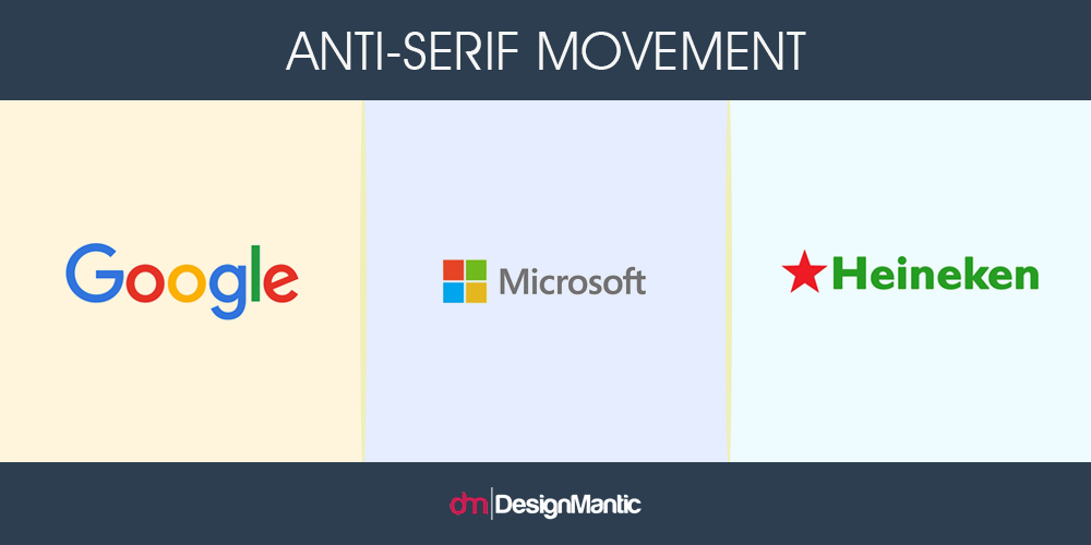
When one of the most influential and potent tech companies around the globe and the world’s most powerful search engine changes its wordmark by eradicating any hints of serifs- which was a key part of its logo forever- we can safely say that we are in the midst of a sea change. As a result of a recent bout of antagonism against serifs, Google’s current wordmark is modern and sleeker, which is designed to appeal to more people. It features better legibility, fatter stems, and no serifs; a big win!
This fact is even supported by real-world data on web fonts. Typewolf, one of the most well-known typography sites on the Internet, proves that San serifs make up 9 out of 10 of the most popular fonts on the web. With such a mammoth organization recently shirking serifs, more and more brands are expected to follow suit in 2017.
8. A Walk Back In Time
In the world of design, nostalgia is an omnipresent entity; as a tool to be drawn on, an inspiration, an influence. However, designers took things to a whole new level in 2016, with some prominent brand identities going so far as to press the reset button entirely. The resurgence of “vintage” logos has jumped on the nostalgia bandwagon that keeps on playing around us.
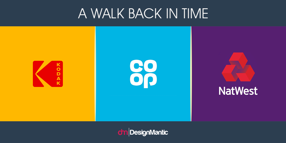
For instance, to coincide with its return to the consumer products market, Kodak bid adieu to the text based branding they had adopted since 2006, and re-crowned their iconic yellow and red, camera shutter icon of the times gone by. Meanwhile, North resuscitated Co-op’s classic 1968 clover-leaf logo, infusing a sense of reassurance and trust to the high street in choppy waters. Similarly, with the cynicism surrounding the banking industry, Futurebrand took the NatWest logo back to a 1968 rendition, in the hopes presumably that people would simply forget the existence of 2008.
In all the cases above, some embellishing and cleaning up was done to adapt the logo to modern sensibilities; simply cutting and pasting the old design wouldn’t have fared so well. However, as a precedent has been set, we believe that 2017 will see a lot of iconic wordmarks poised for a comeback. Customers have potent memories and emotions linked to the past, and a vintage logo can play on nostalgia, speaking to them in a way that a modern counterpart will not. This is something many customers and designers are settling on today, and this is projected to escalate in 2017.
9. Abstraction In Design
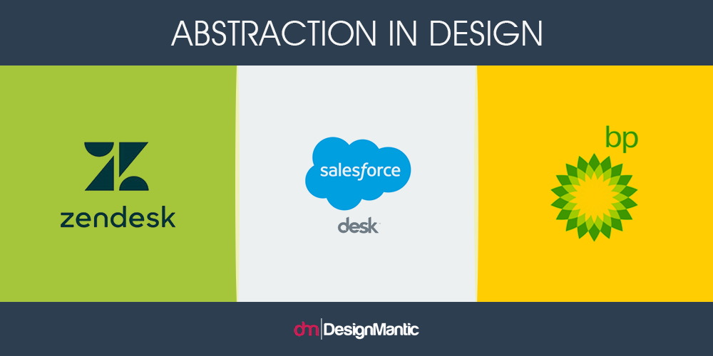
Are you familiar with the customer-service software company, Zendesk? If so, you must have been fascinated by its elaborate mascot; a smiling Buddha wearing a headset! Although the Buddha mascot was often mistakenly taken for the logo of the company, its actual logo was a lotus flower, with its petals folding in over itself to form a heart in the center. Just recently, the company has parted with the lotus flower-heart logo in favor of a design built upon unpretentious shapes as part of its brand identity. In an attempt to go back to the basics, the company chose a capital “Z” as its new symbol logo as part of the rebranding foray, and retained the old “Zendesk” wordmark in the new combination logo.
As 2017 has just begun, we have our fingers crossed that more businesses will take their cue from Zendesk and design abstract logos that will cater better to a truly responsive design future!
Do you think Stimming, Half and Half, and Ombre logo trends will make a comeback in 2017? Do let us know in the comments below!


I really love your post. I like to share this great info post with my logo designers friends.
It is very nice post.