Photography and graphic design are intertwined in a consecrated union and one thrives with the other. While appearing to be interrelated yet diverse fields, each draws principles from the other and learning one can fortify your skills in the other discipline.
It is indispensable for graphic designers to explore myriad avenues of visual design. Since photography is the art of capturing and viewing the real world to exploit a visual aesthetic value, the principles of photography can be leveraged in almost every area of design. Here are a few principles of photography that graphic designers can learn a thing or two from for all their design related endeavors:
1. Framing Helps You Stage A Scene
Framing a scene can help you focus the user’s eyes to only the most pertinent areas of the screen, instead of roving around aimlessly from element to element. The rule of thirds in photography is the most viable way of going about this.
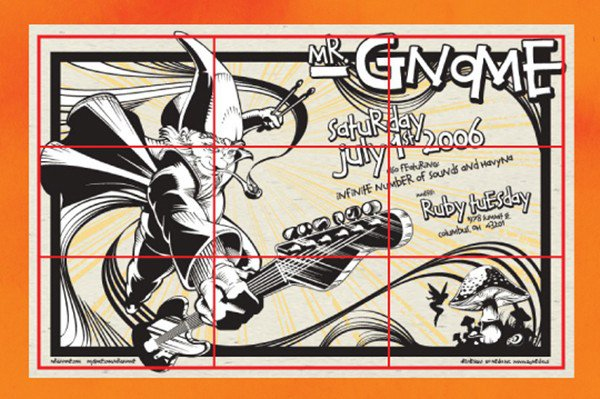
Here is the simple theory behind this principle: Envisage your photo or design being split into a 3×3 grid and divided into different equal compartments with the help of imaginary lines, such as in this striking photography by Trey Ratcliff (@TreyRatcliff). Intrinsically, the user’s eyes would be drawn along these imaginary lines. As such, the best way to depict your target subject is at the intersection of two lines or along one of them.
This principle can be easily applied when you are designing in some kind of two-dimensional space, where you can leverage imaginary lines to establish your own framework. You can also capitalize on the power of perspective and framing to direct the user attention to the most imperative elements of your work in three dimensional space. Avoiding a centered design helps you add some interest and motion to your design. One designer who plays by this rule is William Beachy (@william_beachy). In the graphics below, the design has been rendered effective and striking by placing focal points at each line intersection.
2. Lighting Affects Mood
No element can affect the emotion and mood of a visual piece as much as lighting, and we are not just talking about brightness here. In addition to the brightness of lightning, its angles, and the coloration of lightening can have a momentous impact on the emotional resonance that your photograph is exuding.
For instance, visualize your subject outside around noon, on a sunny day, in contrast to the same subject sitting inside, with an incandescent light pooling around it from an obscure angle and casting unflattering shadows across the ground.
Even in graphic designing, lighting can go a long way in defining how your arrangements are going to be perceived. When it comes to digital elements and graphic design, you can leverage lighting to incorporate intricate layers of mood to your creations and distinguish your coloration.
3. Be Vigilant And Mindful
Creating an illusion for a client or laying out a poster are akin to composing a picture within the corners of a camera’s viewfinder. Top-notch photography depends a great deal on how a shot is laid out or its composition. Similarly for designers, balance and layout are vital elements. Photo composition leverages the standards of focal points, flow, lines, and balance to create engaging and captivating results for the viewers.
Just like a good photographer, a designer must aspire to hit the perfect balance between the function and purpose of a design, in addition to its aesthetic value. These attributes can come in handy for designers, since they form the foundation of a good graphic design. Just as the subjects in each photograph need to be balanced and centered with the environment, so too must graphic designs if they are intended to appear well-organized and mesmerizing. The better designers master the art of photo composition, the more they can hone in on their graphic design skills.
After a while, photographers start seeing the world around them in terms of flow, placement, and balance, as though they are constantly composing scenes and taking photographs inside their minds. They become more vigilant of lighting and color and pay closer attention to movement. Even when they don’t have a camera hanging down their necks, they develop a subliminal habit of scanning their surroundings for points of interest and possible subjects.
Designers would be prudent to follow through on this level of awareness. As a designer, you can make a point of studying the layout of all stunning web designs you stumble across while scrolling through your RSS feed, or the typographic composition of a poster your eyes fell upon while walking to work. This level of spatial awareness can transfer well to your job to make you more effective and productive as a result, and better at judging the space and scale of design elements you are working with. No more second guessing your layout!
4. Angles Can Make Or Break A Design
This simple photography principle is worth noting. If you stumble across a photographer at work, you’ll see them reaching, squatting in weird positions, stretching, and circling their subjects. If you wonder why, this is because the angle at which a photograph is taken defines at large how it is perceived by the audience. An angle from above can make the subject appear more distant, smaller, and even cuter. Whereas, an angle from below can make the same subject seem intimidating, powerful, and huge.
Sometimes, all it takes is a slight turn of face to alter how your design element is interpreted by the people. Graphic designers who know how to use angles to their advantage are wise to do so. In fact, angles are one of the most interesting design elements that designers have mastered to add some interest and creativity to flat designs.
5. Leading With Lines
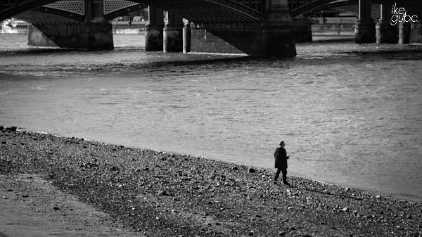
Our eyes are programmed to be naturally drawn along lines when we look at a photo. Photographers go to painstaking lengths to decide how to place lines in their composition, so that they can impact the way people view the image; pulling them towards the picture, into the picture, or leading them on a journey through the picture. Lines come in myriad types- radial, zigzag, curvy, diagonal, and straight- and each has its own use in enhancing the composition of a photograph, such as in this mesmerizing shot by Pierre Metivier (@PierreMetivier)!
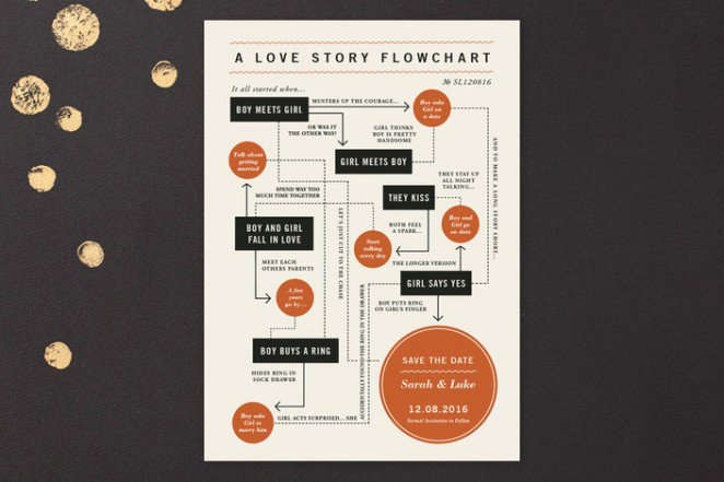
Just like we point at something to make people look at it, designers can control the viewpoint of their design by positioning shapes and lines in certain ways to determine where they want their viewer’s gaze to linger when they see the design piece. Flowcharts is one of the most common use of such leading lines, since they can be leveraged to direct the viewer’s eyes from one point to the next intuitively. Paper and parcel (@paperandparcel) designed this ‘save the date card’, where flowchart leading lines are employed to present the information in a unique and fun way.
Leading lines can also be used in design to guide the viewers to various points or tiers of information. By diligently adjusting and positioning the leading lines, designers can not only focus the viewers’ gaze on the central point of the design, but also direct it throughout the rest of the design. This poster design by “Design by day” (@Design_By_Day) employs the same principles to lead the eye towards the title and then through multiple rungs of information to evoke curiosity in design.
6. Balancing Elements
While we have seen how playing by the rule of thirds and placing the main subject off-center in a photograph creates a more interesting picture, it also tends to leave a void in the picture which can render it an empty look. Photographers aspire to balance the “weight” of their subject by incorporating objects of lesser importance in the photograph to fill the void. In the photography by Shannon Kokoska below, the building on the far end of the snapshot balances out the visual weight of the road sign.
Balance is an important element to get right, not only in photography but also in graphic design. Each element in your graphic design piece has a weight to it. All these weighted elements should be balanced out, until an effective equilibrium is attained. This balance can be attained in two ways:
- Symmetrical Balance: This balancing technique uses symmetry to balance out your design elements. Designers can create a strong sense of balance by reflecting certain design elements from top to bottom or left to right. Jennifer wick (@jwickdesign ) designed this striking wedding invitation by reflecting the positioning of graphic elements and type, to create a beautifully balanced, clean, and chic design.
- Asymmetrical Balance: This technique steers clear of symmetry to create notion of balance. Munchy Potato designed this beautiful poster which employs Asymmetry by purposefully scaling and dispersing elements.
7. Making Your Photograph Worth A Thousand Words
A plethora of factors contribute to visual storytelling in design. Photography is one of the simplest forms of storytelling. If Photographers can communicate an easy to comprehend and compelling story in a single snapshot, this creative ability can be transferred to graphic designers as well. And when it does, designers would stop feeling the compulsion to simply “fill the space.”
Photography and graphic design are similar in essence when it comes to what they require from a creative. As a designer, learning the art of photography won’t make you the “Jack/Jill of All Trades”, but it would reinforce your core skills as a graphic designer and diversify the application of your creativity. The stronger it becomes, the more liberated you will feel to create compelling stories and images that are set to wow.
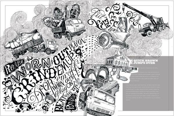
This corporate brochure has been designed for Nike by Fiodor Sumkin using ink gel pen, to narrate the visual story of the company’s reuse/use process. It combines detailed patterns, images, and typography to tell a story.
8. Little Details Matter
More often than not, Photographers spend hours of labor trying to capture every single detail to perfection in a shot, so that it conveys the correct message and evokes all the right emotions. Photography compels you to observe and be mindful of your surroundings. It entails you to have your own point of view, your individual perspective. As any photographer would tell you, there is a sense of urgency and deliberateness associated with taking a snapshot. A photographer checks his exposure, studies the subject, and waits for the right moment before he presses the shutter release when he feels the urge to do so. A photographer wouldn’t capture a single photograph until he feels the need for it.
Thus, a photograph can be construed as a by-product of a long series of contingent events that revolve around the photographer. A well-defined process envelopes this chain of events. Anything from the color, composition, content, to the subject lies at the mercy of the photographer.
This attention to detail is imperative for graphic and web designers to ace who don’t want features that fail to function as intended or let minute mistakes slip by in a layout, only to stare back at them in the finished design. A plethora of components have to come together and blend seamlessly to create the flawless photograph, just as there are myriad aspects of websites or elements of design that need to work impeccably. A sharp eye can avert any slip-ups and thoughtless mistakes that can result in a design chaos. The fascinating level of detail in the poster below must have taken painstaking days to get right, but makes sure all intricate elements and details merge as one.
There is so much going on in this poster by Studio JQ, with so many intricate details, yet this poster is far from overwhelming.
The Greatest Power Lies In Making The Ordinary Extraordinary!
The most important and greatest power of a photographer lies in making the ordinary seem extraordinary! At the end of the day, it’s all about unearthing the beauty in the simplest of human beings and evoking the emotions in the dullest of subjects, or being able to capture the exact moment that can be reminisced with a waft of nostalgia whenever one looks at the picture.
Design and photography are both about eradicating the fluff and the superfluous exterior, portraying the concentrated essence of something, and giving people a clandestine glimpse of something they might never have seen, noticed, or considered before. While this can be a little hard to pull off for designers, it is nonetheless achievable if one delves into the intricacies of photography and learn from it.
Can you think of some other quintessential elements of photography that designers can find useful? Do let us know in the comments below.














Best combination of photo tips and design guides I’ve seen in a while.