Halloween is one of the highest-grossing holidays of the year. Last year, in 2021, people spent $10.6B during the spooky season. It was the largest amount spent in the history of Halloween spending. For businesses, big and small, it was a sign to gear up their marketing for Halloween and get ready for some serious amount of profits.
If you are an SMB and looking to get your own nibble of this very delicious pie, the work starts with getting your logo ready for Halloween.
Here’s how you can up your spook-game this Halloween and make people remember you fondly with your logo design.
1. Add Halloween Imagery
Arguments can be made for subtle aesthetics in branding, but not when it comes to Halloween. This is a time when OTT is the bare minimum you can do.
So take this philosophy and decorate your business logo with some Halloween flair: creepy ghosts, ghouls, and goblins. Jack-o-lanterns, bats, witch’s hat and broom, gnarly trees, and gravestones are also some of the most popular Halloween images you can try.
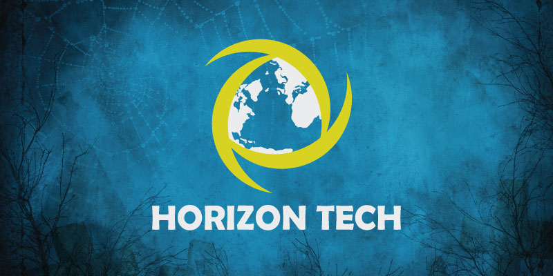
Once you have decorated your logo, don’t stop there. Take it up a notch and arrange all your web icons in a cascade of scary buttons. This may include your social media icons, your Halloween-y call-to-action buttons, and your menu tab, too.
2. Introduce spooky animations
We all love an animated logo that we can engage with and be entertained by. A logo that can tip its witch hat to you when you hover over it, or a scary jack-o-lantern that gives you a creepy smile worthy of Joker as you try to click on it.
Animating your logo will make the fear come alive in your design. You can make the bats fly out of it, turn the font into a dripping mess of red-hot blood, or even add some sounds to it to inspire some honest-to-God dread in everyone.
3. Bring In A Mascot
Even if your brand doesn’t have a mascot, do not let it deter you from introducing one this Halloween season.
Mascots are intelligent brand elements that endear a brand to its audience. It becomes a more alive version of your brand that people can communicate with, interact with, and have human-like feels about.
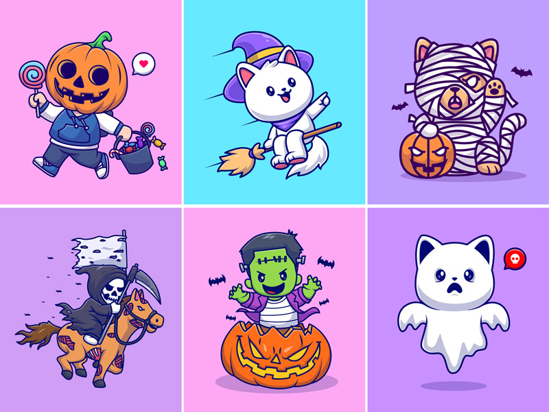
Image Source: behance/catalyst labs
You can use this year’s Halloween to introduce a brand-new Halloween mascot for your brand. It can be in the shape of an animal, cartoon, human-figure, or anything else that your imagination produces — as long as it’s scary and spooky.
4. Make The Background Eerie
If you are not ready for anything major, like introducing a brand-new Halloween mascot, perhaps something subtler may be more up your alley. Something like creating a new background for your brand logo.
This trick works best for brands that want to celebrate the spirit of the holiday but without too much hoopla. A business that wants to retain its serious and professional imagery. A lawyer’s office, perhaps. Or something to do with a financial company logo.
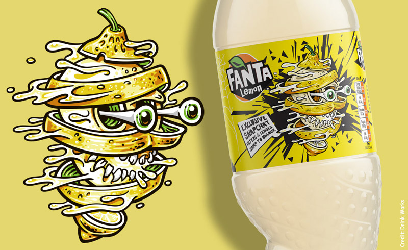
Image Source: behance/Rainer Michael
By changing the background of your logo, you celebrate the holiday without changing anything about your brand personality.
5. Throw In A Creepy Font
For brands that have wordmarks or other typography-based logos, DesignMantic, for example, there are tons of ways you can dress up your fonts to make your customers’ skin crawl and make your logo look really spooky.
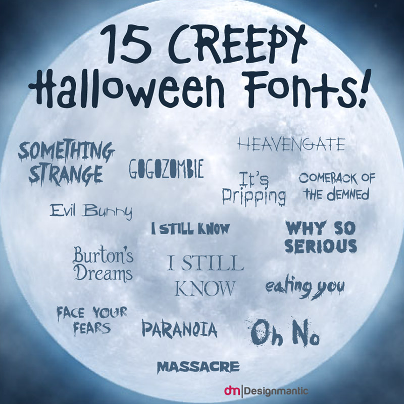
Feast of Flesh, Theme for Murder, Gypsy Curse, Nemo Nightmares, and Zombie Holocaust are some of the top free fonts that will do justice to your desire of creepy-fying your font-based logo.
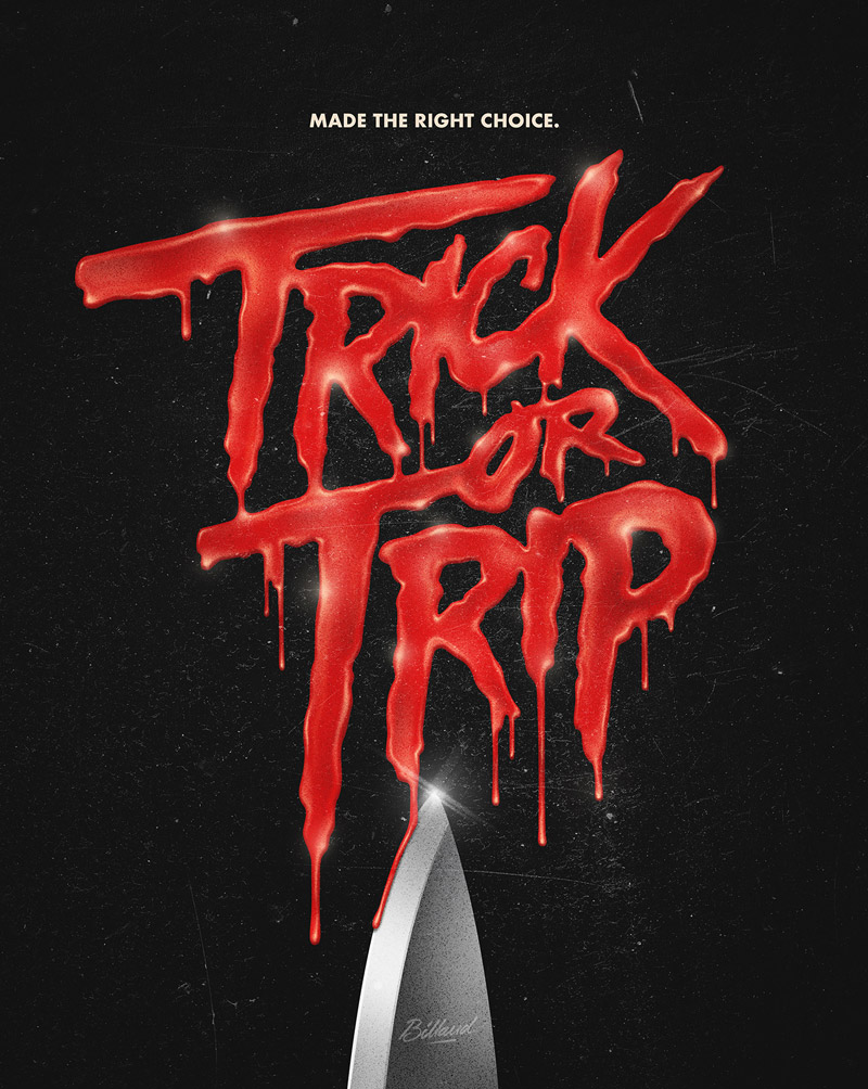
Image Source: behance/Romain Billaud
For those of you who aren’t willing to write their entire brand name in a new font and are concerned about brand recognition, a few changes for a few days won’t hurt your brand. Still, if you don’t want this commitment, you can get the same effect at a lower level by playing around with a few letters instead of the entire name.
6. Voodoo-color Accents
Another low-key trick of making your logo look Halloween-ready is to play around with some color. Even if you are not yet ready to give your logo the full color treatment, a few pops of holiday-specific hues will go a long way.
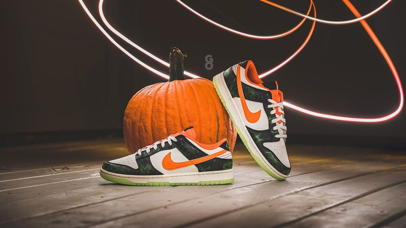
Nike usually celebrates the spirit of the season by coloring its iconic Swoosh a bright pumpkin-yellow.
These color accents allow well-known brands to keep themselves and their branding relevant and responsive while staying true to their core character.
A clear, meaningful tagline has always been one of the great brand assets. It communicates a brand’s purpose and its personality in a short and catchy phrase that, hopefully, becomes memorable. Crest, the oral hygiene brand, launched a ‘Bring On The Candy!’ campaign last year at Halloween and drew great praise.
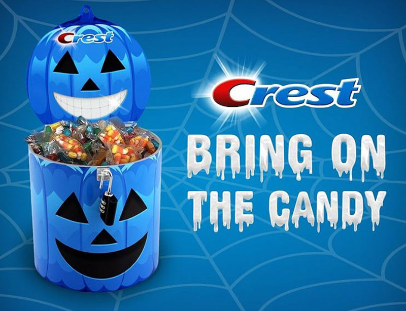
Image Source: sweetiessweeps.com
Not only was the tagline so clever, it was also brilliantly apt and funny. Instead of lecturing its audience not to eat candy, the brand encouraged them to get more of it because Crest is there to take care of you.
Another great example:
A sooper fun way to connect with your audience.
Lastly, Give Away Free Trick-Or-Treat Bags Decorated With Your Logo.
Nothing shouts Halloween louder than candy and all delectable treats set to tantalize your sweet tooth.
If you truly want to infuse the spirit of Halloween to your business, get customized reusable goody bags designed, adorned with your logo on the front. Fill them up with scrumptious treats, and perhaps a coupon for a return visit plus your business card. Then make sure no clients or customers leave without carrying off a bag.
Related: 21 Halloween Resources To Design The Living Daylights Out!
Granted, the candy will be devoured soon enough and the wrappers ditched down the drain, but the festive gesture and the goody bags flaunting your company logo will keep your business in their minds for a long time to come.

