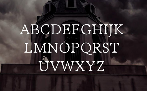
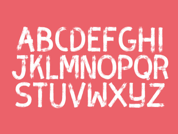
Types, typefaces, and fonts – all these terms point to the lettering variety that has made it possible for the designers today to come up with unique ideas to express their writing style. When a certain designer focuses on composing types in a different style for a brand identity poster or website, he tends to create fonts that vary in their values, readability, and cleanliness, and the type of audience intended.
It all started in the 13th century when lettering experts aka typographers would use a single letter tile to create letters, the signs of which are still evident on the walls of ancient buildings in Europe. In the 15th century, metal type was invented for the ease of typographers, after which the type family kept expanding in its forms and styles.
Did you know the difference between a serif and sans-serif font? No?
The only difference here is that of the ‘leg’. Yes! The serif characters have a projection at the ends; the sans-serif, on the other hand, are the ones without the ‘leg’. If that still confuses you, just remember that the ‘sans’ in the sans-serif means ‘without’. And even without the leg, it could break the dance floor (you get it, don’t you?)
Every professional designer is hardwired with basic font knowledge and is able to differentiate between basic serif, sans-serif, hand-written, vintage, retro, and brush fonts etc. The world of fonts has characters of every shape, size, and style, which is why you see a variety of types surrounding you, expanding your knowledge of the kinds of typefaces.
So, in this article, we’ve gathered 25 valuable gems from the depths of the typographic domain (to be exact, we dig these from Behance!). All these fonts and types come from up-and-coming designers and typographers, who are ready to inspire the world with their creativity, be it text logo design, typography posters or intuitive brand messaging. To make things a bit more fascinating, we’re going to describe each font in three words followed by the intended ‘surgery’. In addition, we’re going to dissect these fonts to get an insight of what’s going through the creator’s mind and where these fonts can be used.
1. Beyno
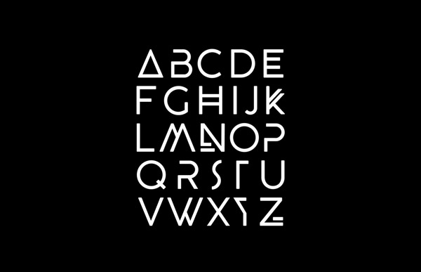
Simple. Minimalistic. Unique.
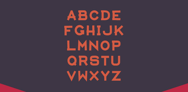
This one belongs to the simple sans-serif family, with each letter presented in the uppercase. According to the creator, Fabian Korn, this type is eye-catching and can be used for headers in posters, headlines, and everything that’s meant to appeal to the modern audience.
2. Beautiful Bloom
Handmade. Chic. Beautiful.
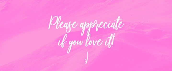
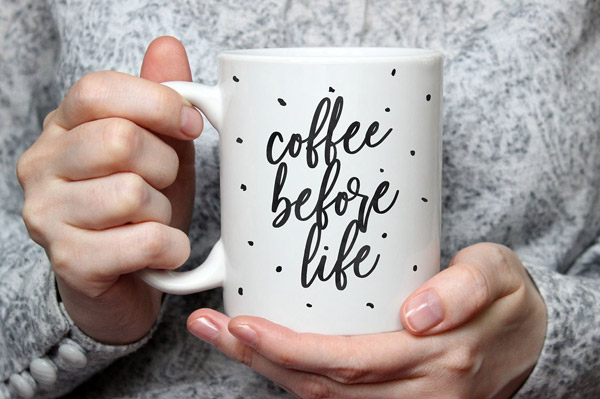
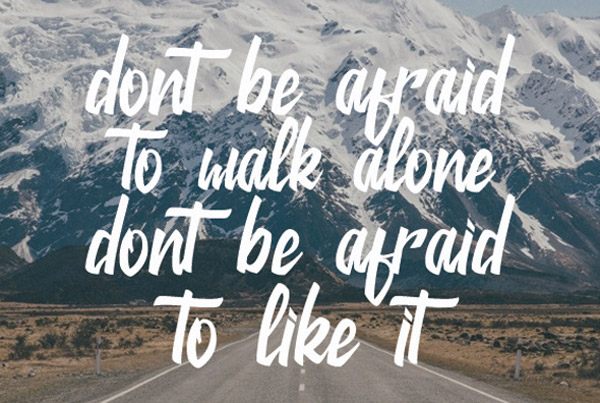
Beautiful Bloom is a brush font that comes from the handiwork inventory of the designer, Mats-Peter-Forss. This wonderful curvy and stylish font has an overall casual aura that can be used for wedding invitations, chic wedding logos, Instagram posts and much more. Plus, both upper- and lowercase alternatives are developed by the designer for ease and better adaptability.
Related: 8 Typography Tips To Ensure Web Accessibility
3. Argo
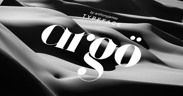
Bold. Beautiful. Sophisticated.
If you remember the 2012 film Argo, then just know that this elegant typeface is nothing like it. Argo is a serif typeface with a twist. To add a more fluent touch and versatility to the font, Anthony James replaced straight lines with some medieval-style ascenders. Including all the essentials of a typeface, Argo contains 180 characters, all of which are suitable for luxury, fashion and food brands, and magazines and so on.
4. Aventura
Adventurous. Camp life. Fun.
One look at this font and you’ll relate your childhood campfire stories with it. As a simple serif, this font is best suited to the campfire, adventurous journey, and bonfire invitations and summer camp websites and banners. All the alphanumeric characters are bold and uppercase, showing a sense of urgency to get your backpack ready for the group hike you’ve been planning recently. Plus, it’s free for personal and commercial use. What more would you want?!
5. Building
Metallic. Tall. Corporate.
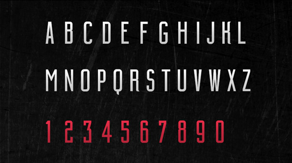
Leonardo Gubbioni wanted to develop a typeface that has a serious yet strong vibe. Taking his hint from the concrete jungle we live in, Gubbioni created ‘Building’ – a font in an Art Deco style, but moving the current like the metal-framed buildings to create that sheer impact. All the alphabets are the upper case with number and glyphs intact. And it’s free to use for personal purpose!
6. Argon
Puzzle. Modern. Sporty.
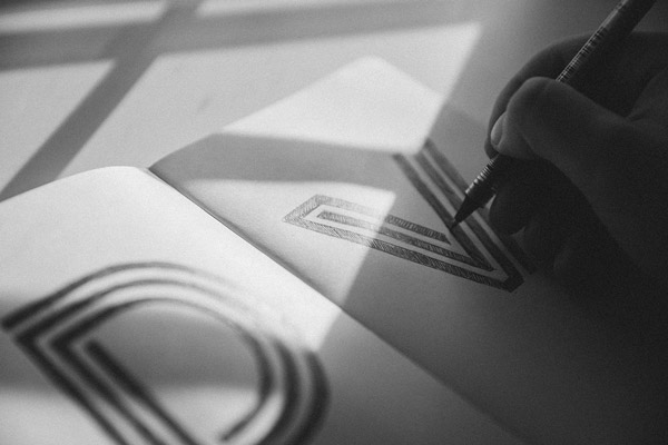
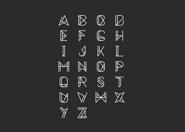
If you’re a fan of puzzles, then this typeface is going to fascinate you more than anything else. Argon is a geometric font that took the designer, Tom Anders Watkins, months to put together to make each letter a solved puzzle. The alphabets are all uppercase, with a trendy edge. These can be used for anything adventurous, modern, and referring to the hip culture.
Know How To Keep All The Elements Of The Typography Intact? Read On The 10 Nifty Kerning Tips To Boost Typography
7. Lamu
Inspirational. Traditional. Aesthetic.
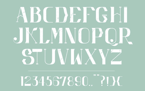
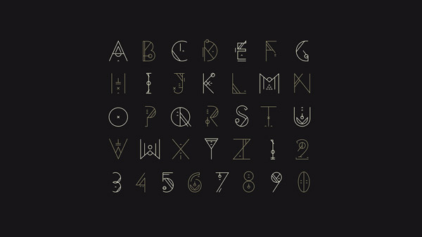
Inspired by his love for the Lamu Island and its architecture, Dicky Jr. came up with the Lamu typeface. Each and every character and glyph corresponds to various architectural features of the island, such as curved windows, tiny streets, straight buildings, and even the stone texture. The best thing about this font is that it preserves the aesthetics and the cultural uniqueness of its inspiration.
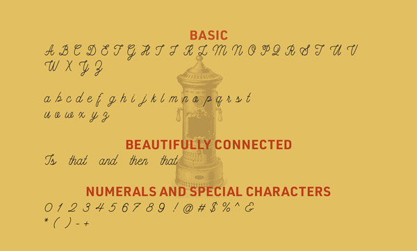
8. Buffalo
Loopy. Offbeat. Fluid.
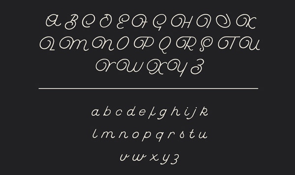
Like other script fonts, Buffalo is a curvy, monoline typeface that gives off a vintage vibe. Available in both upper and lowercase alphabets, the soft endings and the slanting position makes it suitable for promotional branding. And let’s not forget: it’s a freebie!
9. Metrica
Sharp. Mechanical. Ultra-Modern.
Another one inspired by the metropolis, Oliver Hardman couldn’t think of anything more geometrical and flatter than the large buildings in the area. With three different weights, Metrica slays the type view angle in a striking manner.
10. Illusive
Minimalistic. Nature. Alluring.
As cool as the name of the typeface sounds, its background story is also interesting. It is a part of a project called the Illusive project that represents a musical album called Zenith. Though the project revolves around the electronica genre, it focuses on nature and its aesthetics. The typography, however, is aligned parallel to the project with its minimalistic look and naturalistic approach.
11. Yolan
Simple. Sweet. Elegant.
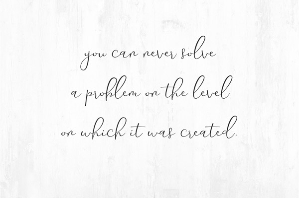
It’s thin, it’s curvy and it’s unique. It’s Yolan by FadeLine. This script font is crafted with details that bring out the elegance, delightful charm, and the firmness of character. Did you notice the font dancing? When used for the suitable business and products, it can make your design look like its alive!
Related: 8 Typography Mistakes Designer Make!
12. Brayline
Versatile. Oldie Goldie. Swashed.
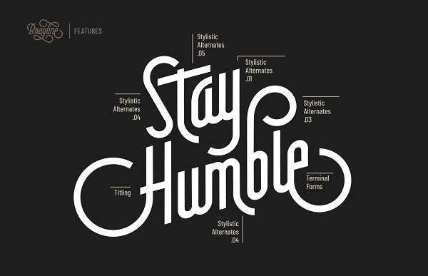
You might see types like these on old beer bottles, but Chrisb Marquez made sure he added that unique touch to this monoline script font. His inspiration: Old and flashy neon signs. This is one of those versatile fonts that include more than 400 glyphs with numerous variants. According to the designer, the font is best suited for signage, book covers, packaging, invitations, and corporate logotype etc.
13. Chelsea
Sophisticated. Simple. Regular.
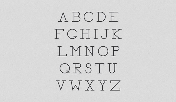
As simple and sober as it seems, Nathan Thompson created this font and named it after the love of his life, Chelsea. Quite romantic, isn’t it? The neat and clean serif font display clear readability and a sense of regularity, which allows it to be used for words, sentences, and paragraphs. It might look like a common one at the start, but you’ll figure the affair out once you notice the details.
14. Lena
Geometric. Soft. Calligraphic.
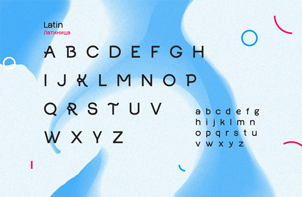
Lena belongs to the sans-serif category but is unique. Why? Because it combines geometry and soft forms to deliver a new and trendy look to the plain type. There are some curves and some straight lines, all combined to maintain a tone of harmony and casualness. It can go well with something aimed for regular use, such as clothing and apparel, brochures, and juvenile-centered products.
15. Bouquet
Smooth. Swift. Clean.
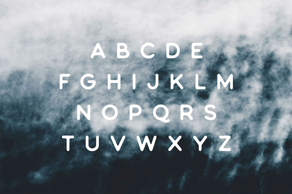
Bouquet is a simple, clean, and elegant sans-serif type. The rounded edges give it a smooth look, in order to ease out the serious tension created by straight lines. It includes uppercase alphabets, numbers, and symbols that add to the variety this font has to offer. And as for its use, you can create headers, logotypes, and other small kinds of texts.
16. Jackie
Hand-lettered. Elegant. Joyful.
Jackie is a modern and elegant script brush font. And you know that the most beautiful thing about a handmade font like Jackie is that it can depict your message in the most jovial manner. The reason why brush script fonts prevail is their way of showing the human behind the font-creating process. However, it can be used for any kind of brand that exhibits joy and warmth with a pint of chic, such as wedding cards, social media business posts, packaging, product design, logotype, watermark, and the list goes on and on.
17. Areen
Modern. Sleek. Less is More.
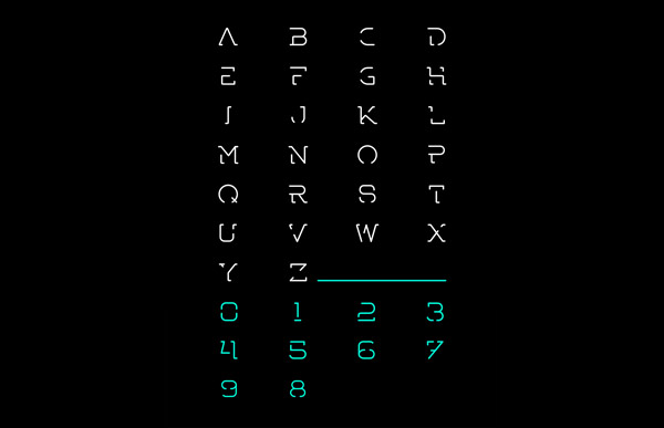
Areen means Lion’s den. Sherif Eid designed this font for an artistic company going by the same name as the font. The inspiration behind it is WESTON font. It’s one of those fonts that are less in appearance, but still, makes sense of whatever message is displayed. Moreover, all the minimalism adds an edgy touch to this futuristic font in the uppercase form.
Kinetic Typography Is A Real Thing?! Click Here To Learn More!
18. Minimo
Super. Slim. Minimal.
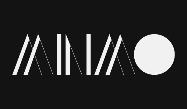
This one-of-a-kind typeface is self-explanatory. It’s probably the simplest form of sans-serif fonts, which just consists of lines forming the basic uppercase letters in a stylish way. The lines are thin and sleek, which make the font appear conspicuous. However, when added weight, this typeface becomes extra appealing, increasing the overall impact and tone of deliverance.
19. Chase
Art Deco. Graceful. Symmetrical.
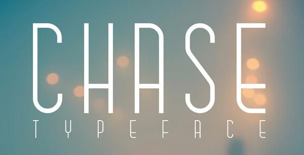
With a sharp emphasis on the upper-hand corner, all the characters in this typeface exhibit overall smoothness and balance in expression. Another one from Anthony James, this one is a classic French version of the Art Deco display font. The lines and shapes in this typeface stabilize the boldness with the sense of regularity it has to offer.
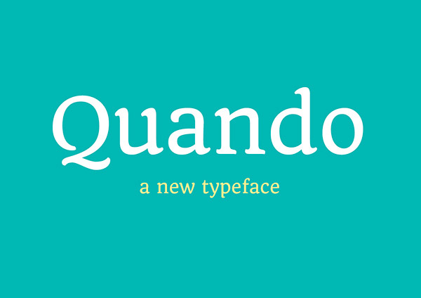
20. Quando
Flexible. Low Contrast. Distinctive.
Quando belongs to that serif category that has been inspired from the handwritten Italian posters from WWII. What defines the flexibility of Quando is its consistent adjustability to smaller and larger sizes. Plus, it’s also low-contrast, which helps it become compatible with smaller sizes and digital screens. Since this webfont is clear and casual, it can cater to a broad range of users belonging to various niches.
21. Mademoiselle
Ladylike. Retro. Curvy.
From the house of Nautica Studios, this monoline curvaceous script font is destined to deliver a retro feminine vibe. The font design was inspired by those used in the 50s and 60s. The designers have crafted this font will all the ladylike characters that don’t deceive the true sense of tantalization. Bet it does best for brands that offer delicacy and a womanly vibe, such as fashion brands, restaurants, Instagram posts, and so on!
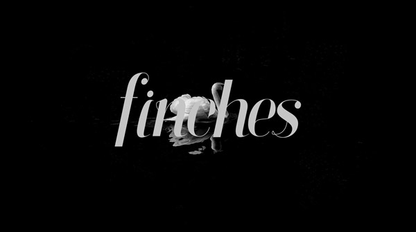
22. Finches
Finesse. Refined. Urbane.
Finches is a professional serif typeface. It’s slightly slanted to the right in a dandy manner and uses contrast to bring out both the thick and thin of design. It’s well-optimized for whatever project you want to use it for because it’s a new design with a new dimension. Whether use it for logotypes or product packaging, its flexibility is quite enamoring.
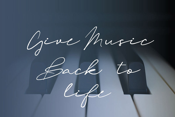
23. Oliver Quin
Random. Creative. Artistic.
By now, you’ve probably learnt that script fonts are those slanting handwritten fonts, but none other than Oliver Quin can reciprocate that feeling. Oliver Quin isn’t a person; it’s a script font that’s meant to look like the handwriting of your favorite celebrity. It has a diverse use in the fashion industry mainly, where the carefree attitude of this font amplifies the intended idea.
24. Maddex
Timeless. Classy. Gorgeous.
Maddex is a unique serif font that brings out the modern look and feel. The sharpness of the edges in the uppercase letters have a distinct quality. If you want, wide-spacing between the uppercase letters can make your type classier. However, it’s also suitable for branding as it gives a timeless appeal to the audience. Overall, the design is neat, clean, and resides within the domains of readability and clarity of expression.
25. Brux
Bold. Full of Life. Awesome.
Remember how adorable those washed up fences lining your yard looked? Brux represents letters in the similar swashed and washed up paint strokes that aren’t only bold, but also are highly adaptable to print or digital projects. This font also has the quality to add some personality to your products and designs. From multilingual characters to a wide array of formats, this font has a versatility of the highest degree.
Care to type in the piece of thought about the types me mentioned above? Let us know in the comments below!
Try Our Personalized Logo Maker:
Create Tailored Letter Logos
Cool Alphabet Logo Designs
Intuitive Logos For App
Logo Designs with A
Letter B Logo Maker
S Logo Designs
Workplace Logo Templates
Logo Designs For Writers
Logos Starting with Z

