The best pass time for everyone is to watch movies. People love to go to theaters and watch movies with their friends, families and colleagues. Movies are definitely the pieces of visual art which have no boundaries and limitations. Post and pre-release of any movie their posters are the main elements which create the hype about them. More than half of the people (i.e. the target audience) decide whether to book tickets and watch the movie or not based on the movie posters. So, the power of movie posters can never be compromised in any given situation. You can actually predict any movie’s mood in the typography used in the poster. There are certain elements which have to be there in a movie poster.
Must-Have Components Of Movie Posters
A movie poster must have a few elements which create the hype and interest in the viewers. These elements include the following characteristics:
• Alluring
The movie poster must be alluring and appealing for the target audience with the highlights of everything that can engage and capture the attention of people. This is definitely a plus point for the movie poster.
• Iconographic
Icons play quite an impactful role. This is the reason why, in modern day cinema / movies, icons are utilized in the movie posters and then they are associated with the theme and idea of the movie.
• Exciting
Movie posters should absolutely have exciting elements to make people wait about the movie. This can be done in multiple ways. Make sure you try to put intriguing elements to keep the movie poster exciting.
• Classy
The stylish the poster, the higher will be the chances of increased talk-ability. At the end of the day, movie posters’ main focus is to create hype and interest in the audience. Classy posters always help in boosting the hype.
• Enduring
One thing which a movie poster must have is its long lasting impact on whoever views it. The stronger the lasting impact, the greater will be the chances for movie poster to be in discussions.
Movie Posters Are First Step Towards A Movie’s Success
These days movies are very differently made and on various concepts. Similarly, the promotions of the movies are also carried out on a different level. These include poster designs and their marketing. If the poster of a movie fails to catch the eyes of people then it loses the quotient of discussion and excitement.
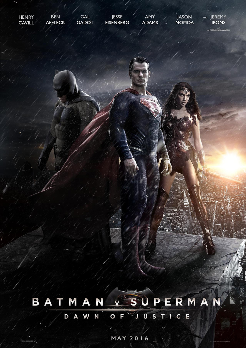
The recent example of such is Batman VS Superman: Dawn of Justice, its poster created a rage over social media and then to other platforms as well. There are many other movies which work carefully on their posters to make them stand out from the rest of the releases. For a successful movie, it is significant to have an amazing movie poster.
Effect Of Graphic Design Trends On Movie Posters
Graphic designers are very creative and can come up with some amazing ideas for movie posters. You might have witnessed that some genres of movies have a set color pattern, for instance horror and thriller movie posters have reddishness and blockishness in their posters, sci-fi movies have stronger elements and shades of blue and silver; plus posters of humor based movies are based on brighter colors, specifically yellow. Graphic designers see the concept of the movies from a tad different angle and then create designs to go with the theme and idea of the movie.
The evolution of movie poster designs is a gradual process. There were times when Arial and Futura like fonts were used in the titles of the movies. But with the passage of times things changes, font styling has changed.
- The bold and bigger titles are for comedy movies, but as the time progressed this label was also ripped-off because of multiple experimentations from the designing aspects.
- For an inspirational movie, posters with highlighted faces and destination points are featured on the movie posters.
- For a superhero based movie, it is important to highlight all the characters along with their superpower (if possible) in the movie poster. This is the new-age style of designing a movie poster.
At the end of the day it’s about how creatively you incorporate elements, characters and icons in the movie poster, along with the typographical experimentation.
Here are a few posters of upcoming movies which will look a lot different in the minimalistic designs; watch-out!
6 Upcoming Movies And How Their Posters Will Look In A Flat World
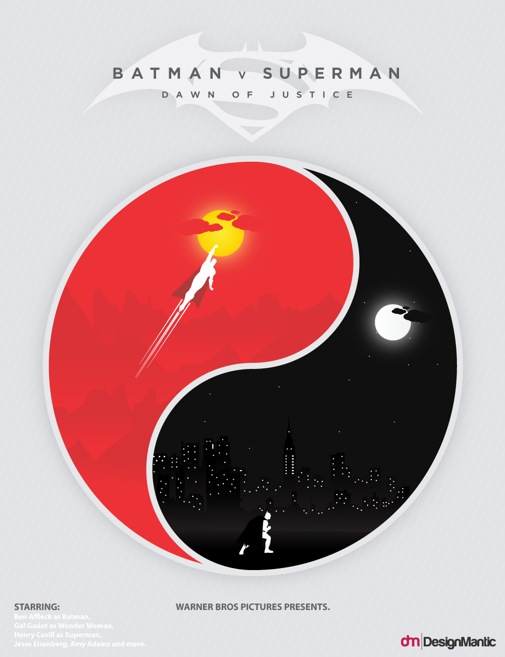
1. Batman Vs Superman – Dawn Of Justice
The Batman VS Superman – Dawn of Justice is a movie which needs no introduction. The trailers of the movie are making viewers and fans go gaga about it. This representation of minimalistic and flat designed movie poster is apt for highlighting the essential and significant elements of the movie. It describes the essences and theme of the movie very well.
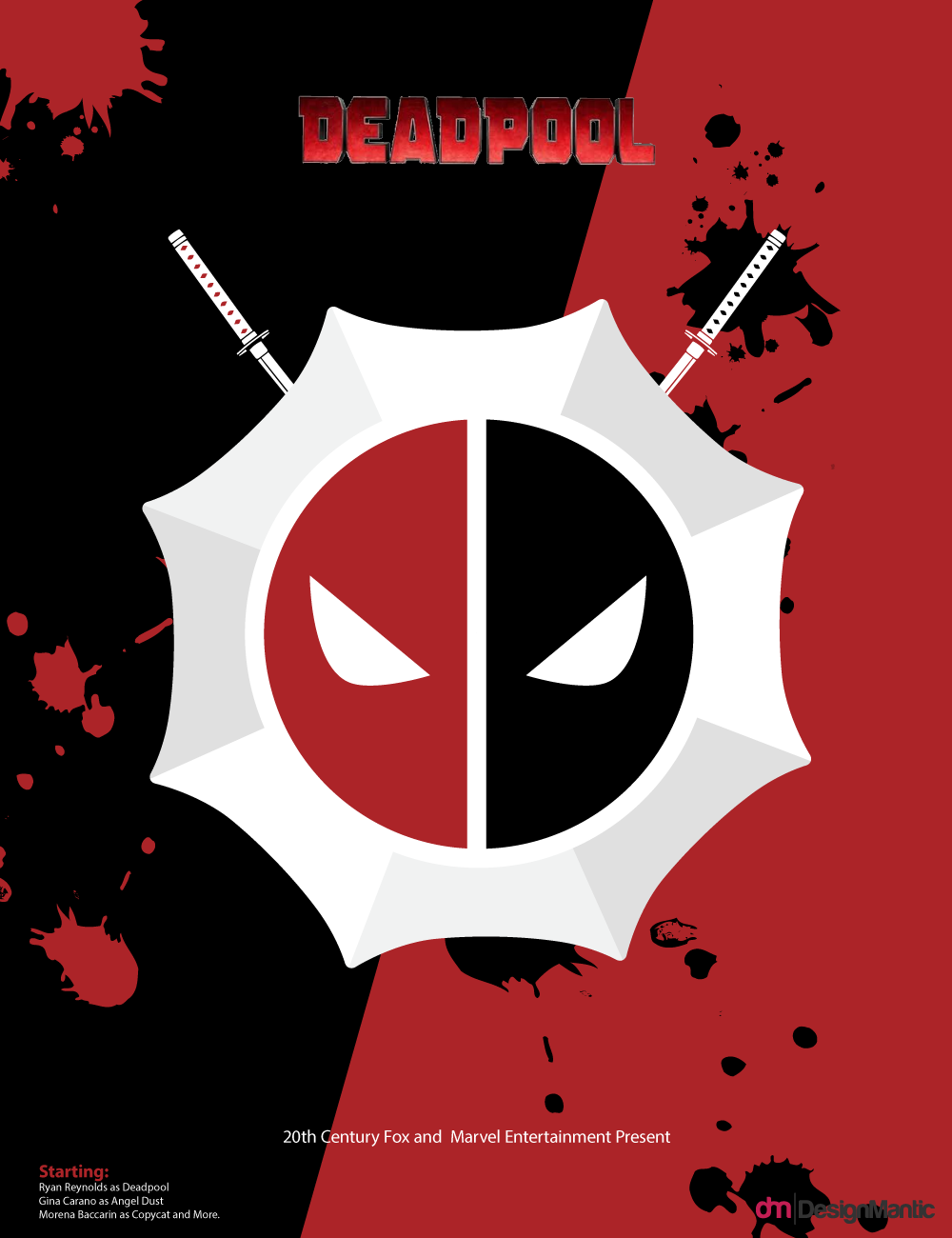
2. Deadpool
Deadpool is breaking records all over the world. Marvel would be proud of it. The movie poster shown above has the interesting and integral ingredients fetched from the storyline of the movie. This defines the command of designer in expressing the thought, concept and ideology in minimal strokes of art.
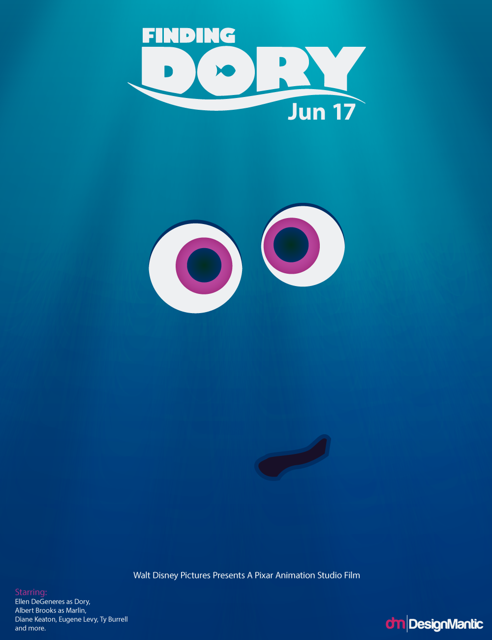
3. Finding Dory
Another interestingly intriguing minimalistic flat design for a movie poster of Finding Dory catches your eyes without getting too obvious. This is another and subtle way of expressing the theme of the movie, which is commendably done by the designer.
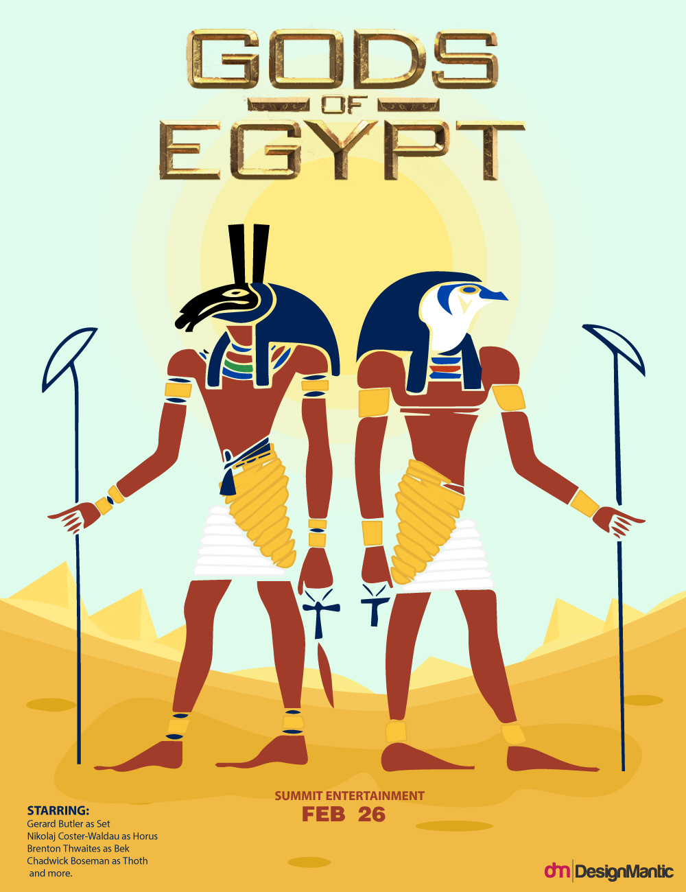
4. Gods Of Egypt
Gods of Egypt is another movie which is under discussion and has its minimalistic movie poster. This is designed carefully to feature prominent pointers. Moreover, this clearly states the nature and ideology of the movie. Those who are interested in such genre will take seconds to read between the lines.
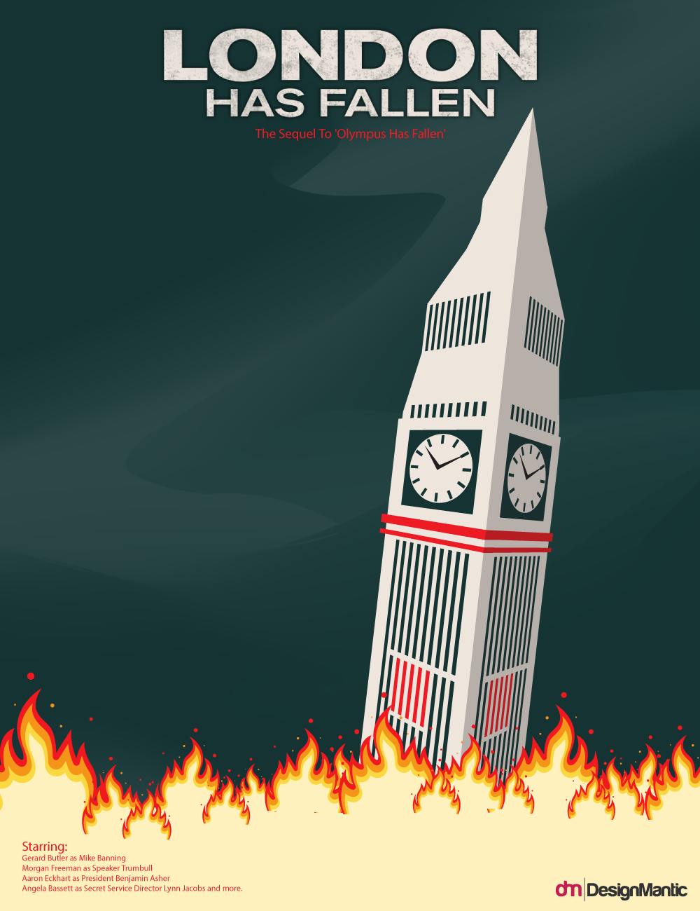
5. London Has Fallen
London Has Fallen is a movie which everyone should watch because of its impeccable script and performances. Similarly, there’s nothing prominent than the features used in the movie poster. This poster best complements the movie’s thematic grace.
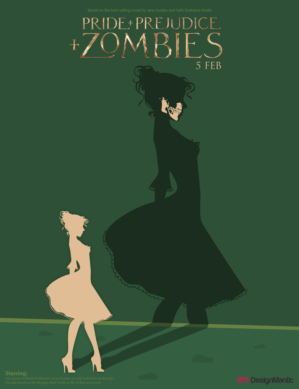
6. Pride And Prejudice And Zombies
The concept of zombies is hugely used in Hollywood these days. The famous book, Pride and Prejudice is read by almost everyone, but the addition of zombies in it would be something to look out for. Similarly, the designer has tried to keep it as simple as possible and integrated nice elements of pride, prejudice and zombies; a fantastic artsy minimally flat movie poster.
With these examples, it is evident that the movie posters have a great logic and ideology behind them. Branding is an important part for movies. Remember Star Wars branding? It is just a hint to understand the significance of movie posters, branding and designing; all mixed together.
Icons + Illustrations: Freepik


