Transport logo designs use a lot of movement and activity in their elements. The icons and symbols, especially, are chosen based on their dynamic qualities. You will often see a lot of road stripes, globes, car swooshes, and zooming lines in transportation logos. These are used to signify speed, pace, and velocity.
Under the umbrella of transport logos, we deal with many industries. These are logistics companies, mailing services, delivery operations, and others. A business that gets you or your cargo from point A to point B will fall under the definition of a transport business. Therefore, car rental services, goods transportation companies, cargo delivery operations, and similar others are related to transport industries.
In this post, we have collected 20 cool ideas; each designed to emphasize a unique aspect of your business. So, browse away and get inspired for your next project!
1. Images That Convey Your Reach And Access
Use logo imagery in forms of symbols or icons that communicate how far and wide your transport operation is established. A globe icon is perfect for such a wide-spread business. It lets your audience see you as a global company without you having to say so.
Image Source: Behance
2. Convert Your Brand Initial Into A Logomark
A great idea to keep your transport company logo simple and to-the-point is to use your brand initials to design your brand’s logomark. A logomark is the stand-alone icon that represents your complete brand logo on its own. Think of McDonald’s ‘M’ or Apple Inc.’s bitten-apple.

Image Source: Behance
3. Make Location Your Best Friend
A location pin is a cool icon that adds whimsy and modernity to transport logo. Simply add it next to your brand name and your logo design is done.
Image Source: Behance
4. Obvious Icon Choices
Always keep your icon choice obvious and simple. Anything that is too difficult to decipher or where people have to spend too much time to understand the relevancy between the brand name and the brand icon can be catastrophic for initial brand recognition. So, keep it simple.
Image Source: Behance
5. Emphasizing Wordmark
Your transportation business logo doesn’t always have to rely on icons. Sometimes, a cleverly executed wordmark can be equally influential.

Image Source: Behance
Related: Past, Present And The Future Of Wordmark Logos – A Study
6. Jet Or Air Transportation Logo
If your transportation company uses air cargo as its main mode of delivery, a jet plane logo or a simple airplane logo can be used as the main icon for your logistics logo.

Shield logo with airplane
7. Maritime Transportation
Transport companies also use ships to conduct their businesses. If you run a shipping service that uses maritime transportation, why not use an anchor logo or a ship’s wheel logo in your logo design?
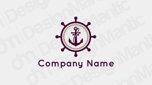
Ship anchor logo in retro style
8. Use A Truck Logo For A Logistics Company
A truck or a dumper etc. is also a great choice for a logistics company logo. It can work for a transportation company, a vehicle transport company, or for any other heavy cargo delivery service.
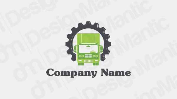
Truck logo with a gear frame
9. Don’t Forget Delivery
Delivery businesses are a huge part of transportation industry and will use the elements of transportation logos to create their brand identities. Letter logos on delivery trucks are a famous icon choice for this niche market.
10. A Car Rental Logo
If you are running a car rental service, a chauffeur service, or a cab service, a car logo is the perfect icon to go for. It is to-the-point, easy-to-grasp, and leaves no room for confusion.
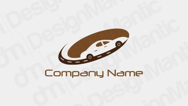
Car logo on brown road
11. A Minimal Transportation Logo
Instead of cluttering your transportation logo with too many details, use a minimal approach and be selective in your choice of elements. A simple font with a minimal icon with a single block of background color is the perfect way to go.
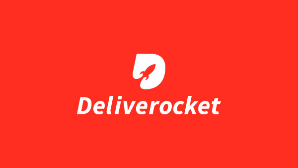
Image Source: Dribbble
12. Keep It Simple
Continuing with ‘keep it simple’ approach, make sure you are carrying this philosophy to create harmonious designs. For example, if you are using an illustrative icon in your logo, balance it out with a cool color palette and simple sans Serif font.

Image Source: Dribbble
Related: An Exploration Of The Figure-Ground Relationship In Transport Logos
13. For A Medical Transportation Company
Medical transportation is also an important part of the wider transportation industry. To create a mature design, think of icons that are relevant to the medical industry, and tie them up with details of transportation like road stripes, etc.
Image Source: Dribbble
14. Show Movement
Your transport logo image must show movement, whether it’s in the form of arrows, swooshes, or other dynamic icons. With a motion-oriented design you are communicating your business nature to your audience in the most immediate way possible.
Image Source: Dribbble
15. Continuous Lines
On the subject of dynamic icons, continuous lines in your transport logo also add activity and movement in your design. So instead of creating a static logomark, think of playing with lines and see where you end up.
Image Source: Dribbble
16. The Road Imagery
While we have talked about adding road stripes in your transport business logos, here is one design that you can check out and take inspiration from. You can convert the road to spell out your brand initials or use them to add movement in your design, it’s your call.

Image Source: LogoPond
17. Use Softer Elements
A softer shade of color, an unimposing but attractive font style with a simple icon is enough to create a striking design.
Image Source: LogoPond
18. Ample Use Of White Space
Using white space generously adds a modern and professional touch to your logo design. It also enables you to show creativity and add a different depth and dimension to your transportation logo.
Image Source: LogoPond
19. Transportation Logos With Animal Images
You can use animal images that are usually associated with speed, power, and agility. Cheetahs, tigers, horses, and wolves are often used in automobile logos as well as transport logos to establish these brand qualities.
Image Source: LogoPond
20. A Fun Design For A Fun Brand Name
If you are working with a fun brand name, think of unique ways to design a fun brand identity to represent that business. Brighter colors, a hand-lettered type, and an organic shape complete the design well.
Related: The 7 Colors Of The Carrier: Color Matters In Transport Logo Design

Image Source: LogoPond
Summing Up
Creating a transport brand logo that is easily decipherable but at the same time inspiring and creative is no easy feat. We hope our collection of these ideas has given you much to think about. As you sit down to create, though, remember to use ideas that feel naturally relevant to the brand character you are working on. In simple words: don’t force the elements; let them come together on their own.
Check Out Our Personalized Logo Tools:
Free Logo Templates For Automobile
Design Transport Logos With Wheels
Create Logo Designs For Cab Services

