Between the place cards, invitations, save-the-dates and more, we realize that a lot of typography goes in to tying the knot!
We know how overwhelming it could be to plan the tiniest details of your big day, and while we cannot be much help when it coming to picking the right dress or wine tasting, we can help you avoid stress for all things font-related. When it comes to designing your own wedding stationary, sorting and sifting through tons of free fonts to arrive at your picture-perfect wedding invitation font combination, can prove to be a hassle.
Here’s a rule of thumb to narrow down your research; font pairing is all about balance. The biggest caveat of wedding font combination is to marry a decorative, fancy font with another decorative font. Nobody ever said “like attracts”! It prevents the eye from being directed to one focal point and makes the design appear busy. Every time you use a swirly or calligraphic font, let that be the star of the show. Choose the second font to be something innocuous that draws attention towards the main decorative font and supports it.
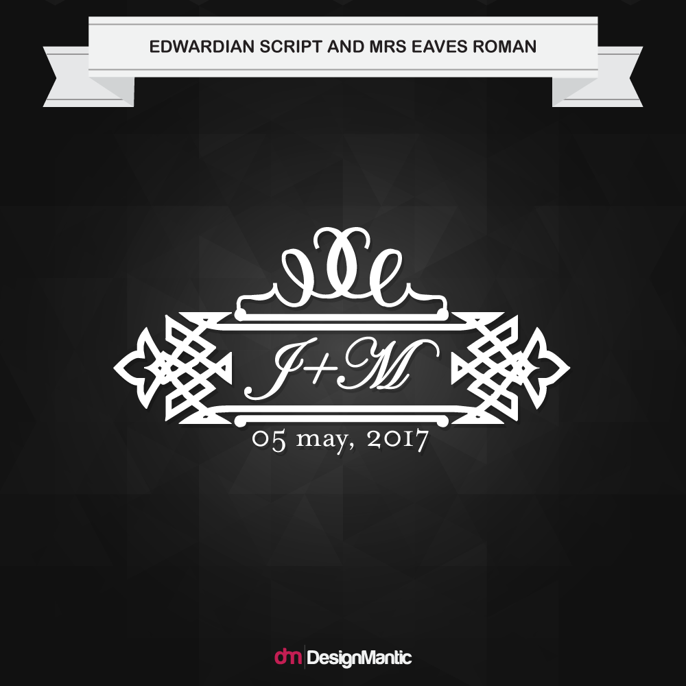
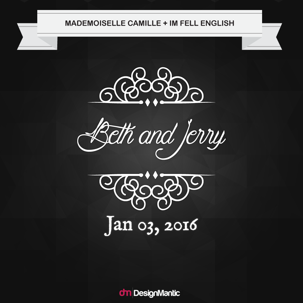
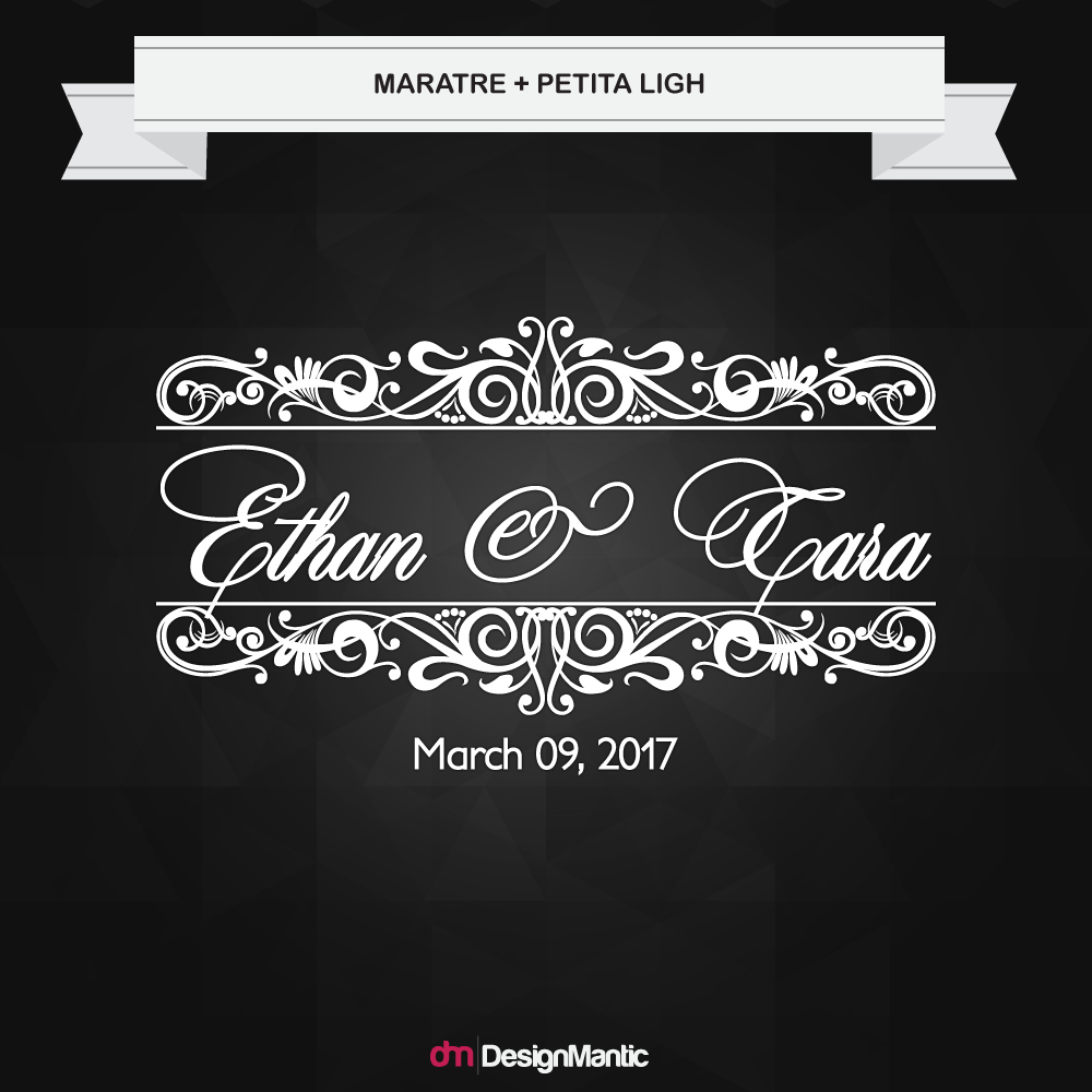
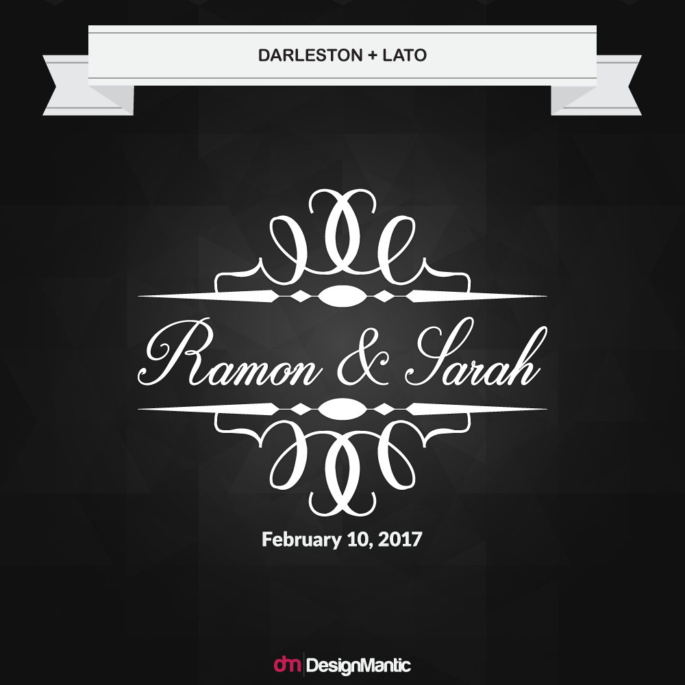
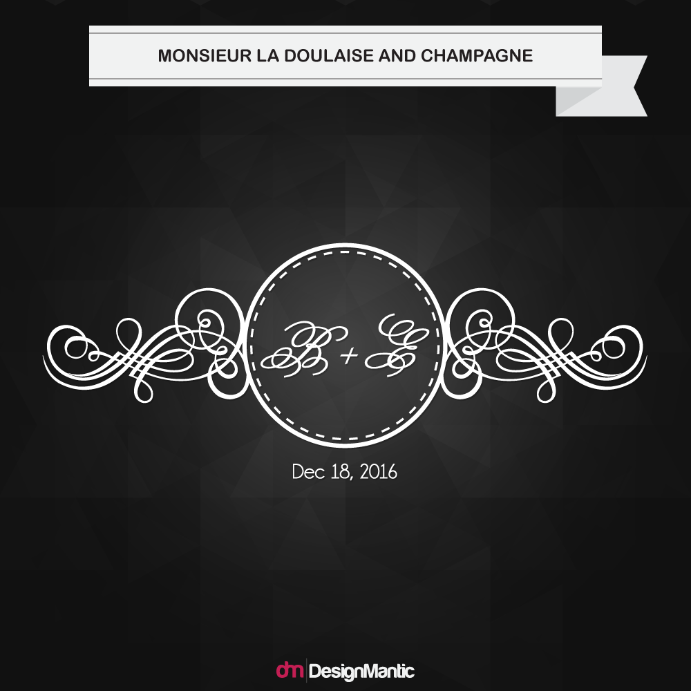
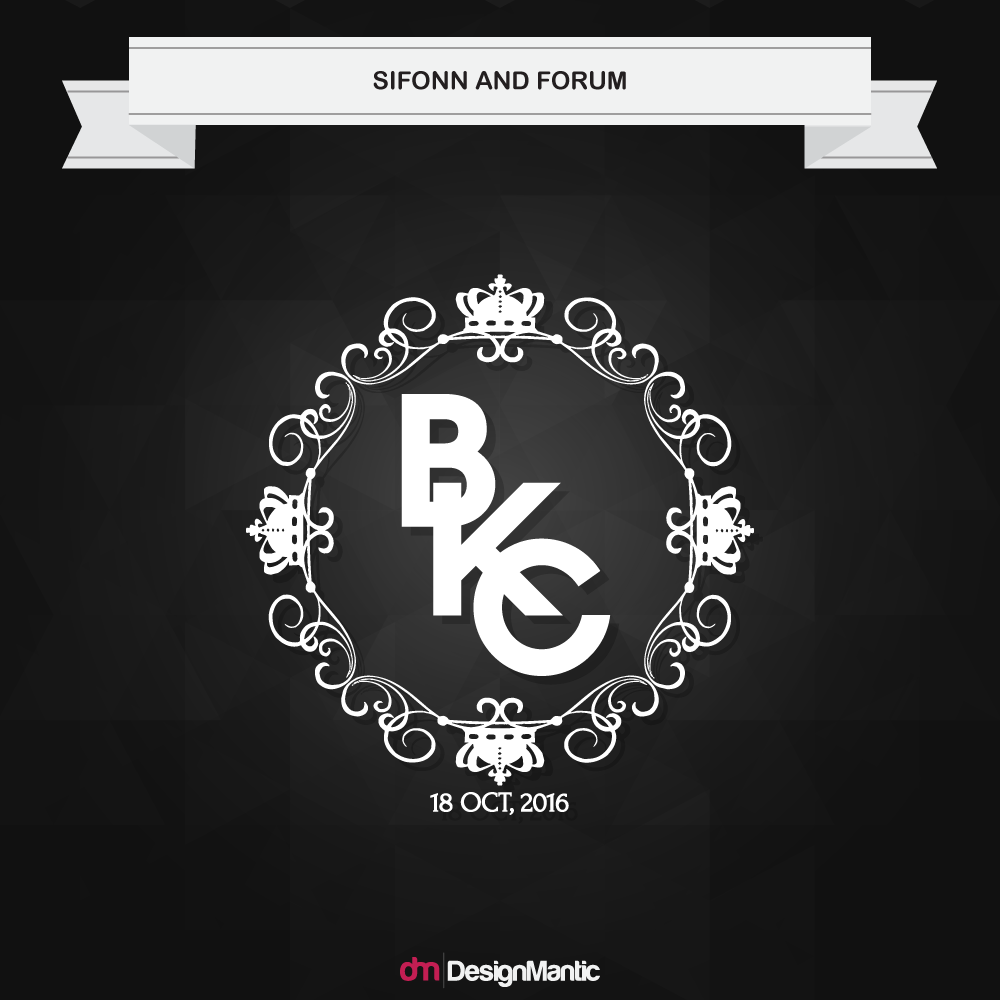
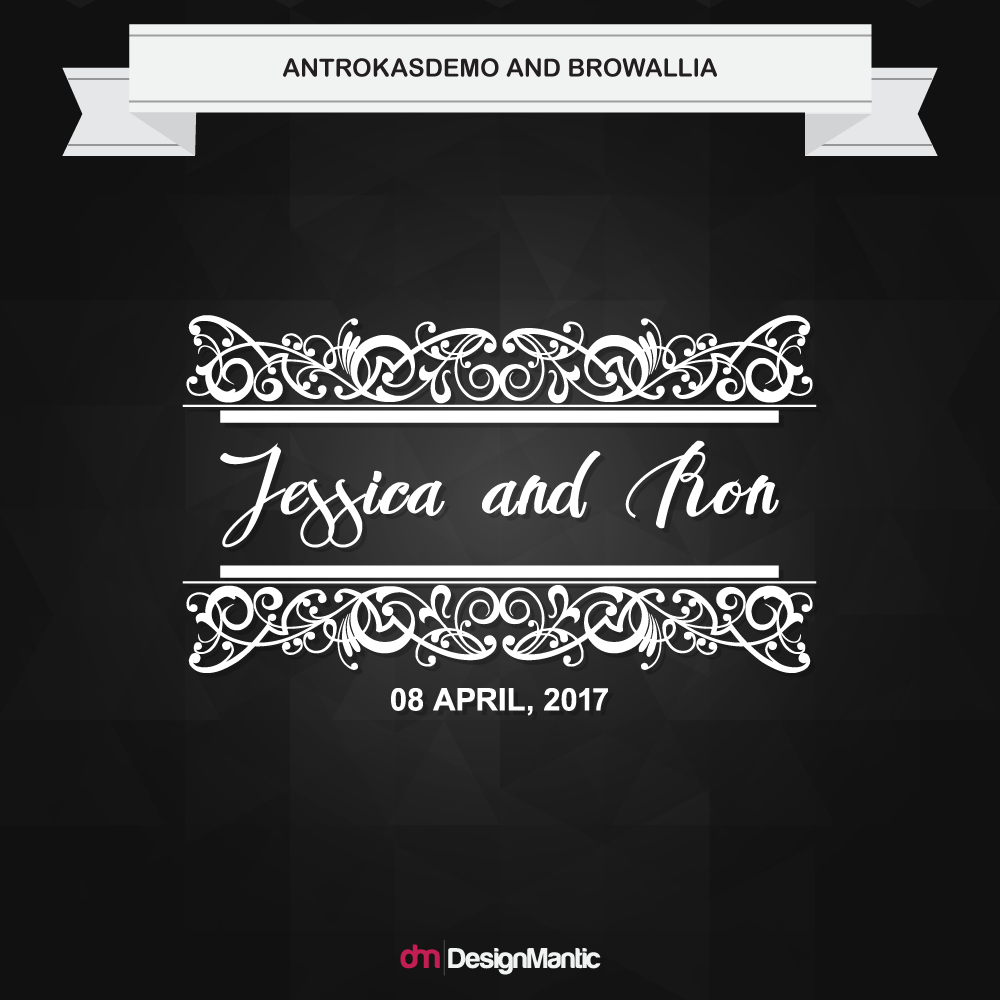
Wedding Monogram Font Pairings
Whether you’re going for a handwritten style, a modern, clean look, or a sophisticated script, we seek to help you find a pair matched in typography heaven! After all, your wedding stationary should be just as perfect as your story! When you read this in conjunction with the tips to create outstanding font pairs we posted earlier, you’ll master the art of font coupling in a jiffy!
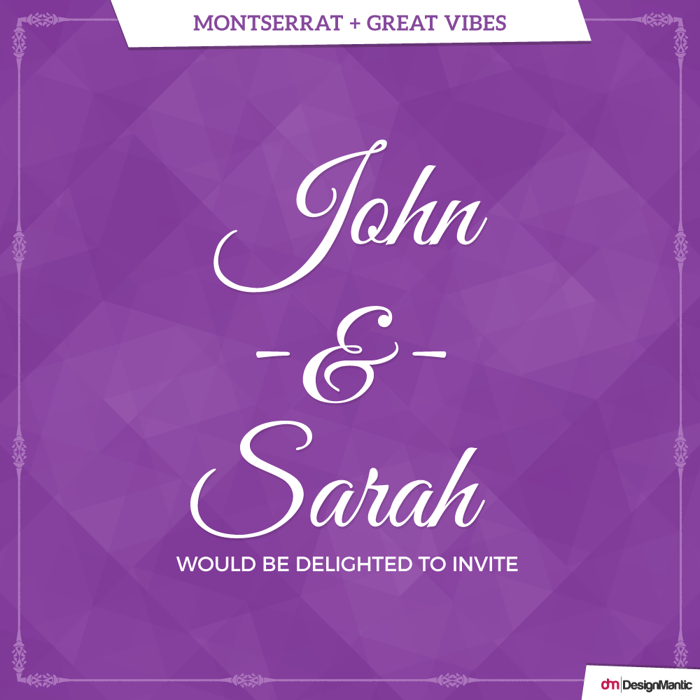
1. Montserrat + Great Vibes
This wedding invite font combination is a classic; a san-serif paired with a cursive font, perfect for wedding invitation templates. When it comes to cursive fonts, Great Vibes affords the most viable readability, which is an indispensable feature of any good design. Its x-height, medium weight, and subtle slant allows great accessibility by employing sophisticated, elegant letterforms.
Montserrat perfectly balances out the round features of the header with its straight, uniform lines. You can tip the angle a notch with its slanted letter forms as well. This imbues an element of interest to your design, without wreaking havoc on the readability of your text.
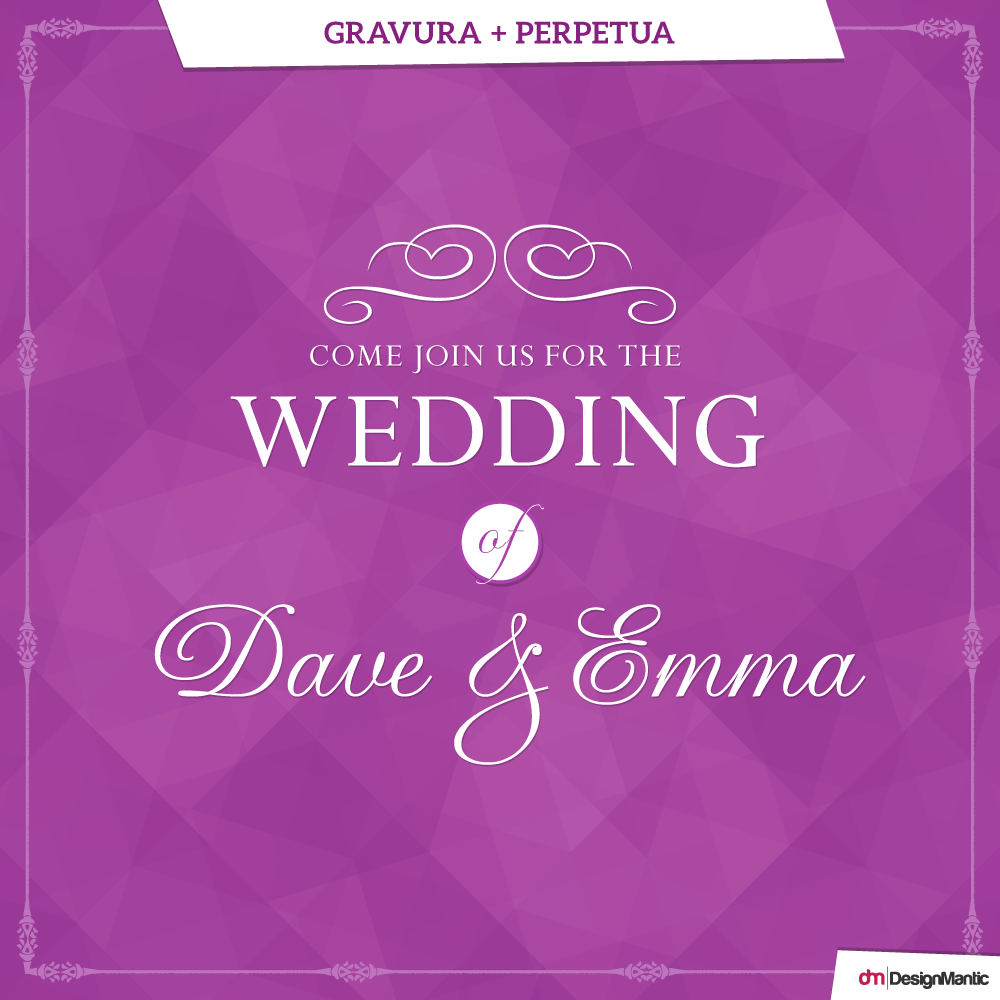
2. Gravura + Perpetua
Penned by the British designer Phill Grimshaw, Gravura incorporates unmatched letter proportions and the perfect stroke thickness. This gorgeous font features innumerable elegant glyphs and countless ornamental end pieces to craft the perfect sentiment.
Perpetua, on the other hand, is the brain child of Eric Gill, first appearing in a limited edition of “The Passion of Perpetua and Felicity”. Though the roman typeface was created in 1925, it’s timeless and classic feel is hardly likely to go out of style anytime soon. Perpetua is said to render a “sparkle” to any block of text, making it the perfect companion to the spectacular nature of Gravura.
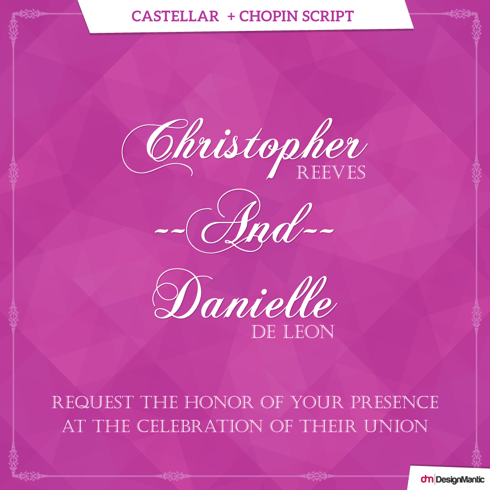
3. Castellar + Chopin Script
Chopin Script, Originally penned by Typographer Mediengestaltung in 2002, is one of the most contemporary fonts on our list. It’s widely recognized by its ornate and bold disposition. Castellan, on the other hand is deemed a display font, most apt for large script and headlines, due to the shaded and incised look of each letter.
Inspired by the classic Roman letters, Castellar is a sweeping love letter to classic royalty, beautifully complementing the bold audacity of Chopin Script. This wedding font combination is perfect if Renaissance and classic is what you are seeking to bind your holy matrimony with.
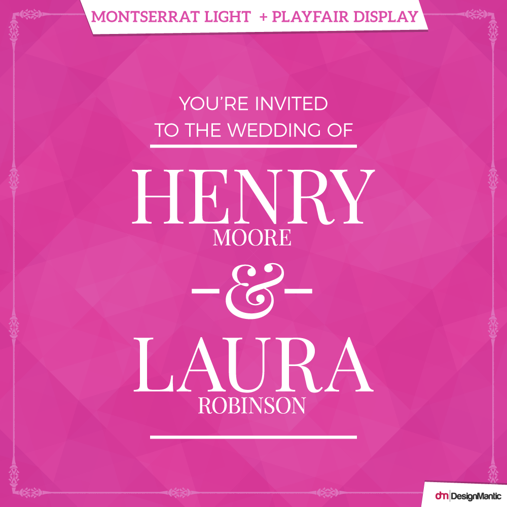
4. Montserrat Light + Playfair Display
The eternal appeal of Serif fonts can be infused in your wedding invite if you opt for this mesmerizing font pairing. Playfair Display, a classic-type serif font, is recognized by the subtle transitions between its thin and thick lines.
Montserrat Light beautifully accentuates it in your wedding card design, with its uniform linearity playing off nicely and subtly with the erect structure of Playfair, without overwhelming the design. The italicized lines serve as a subheading and nuance the main font pairs, alleviating the need for a third font.
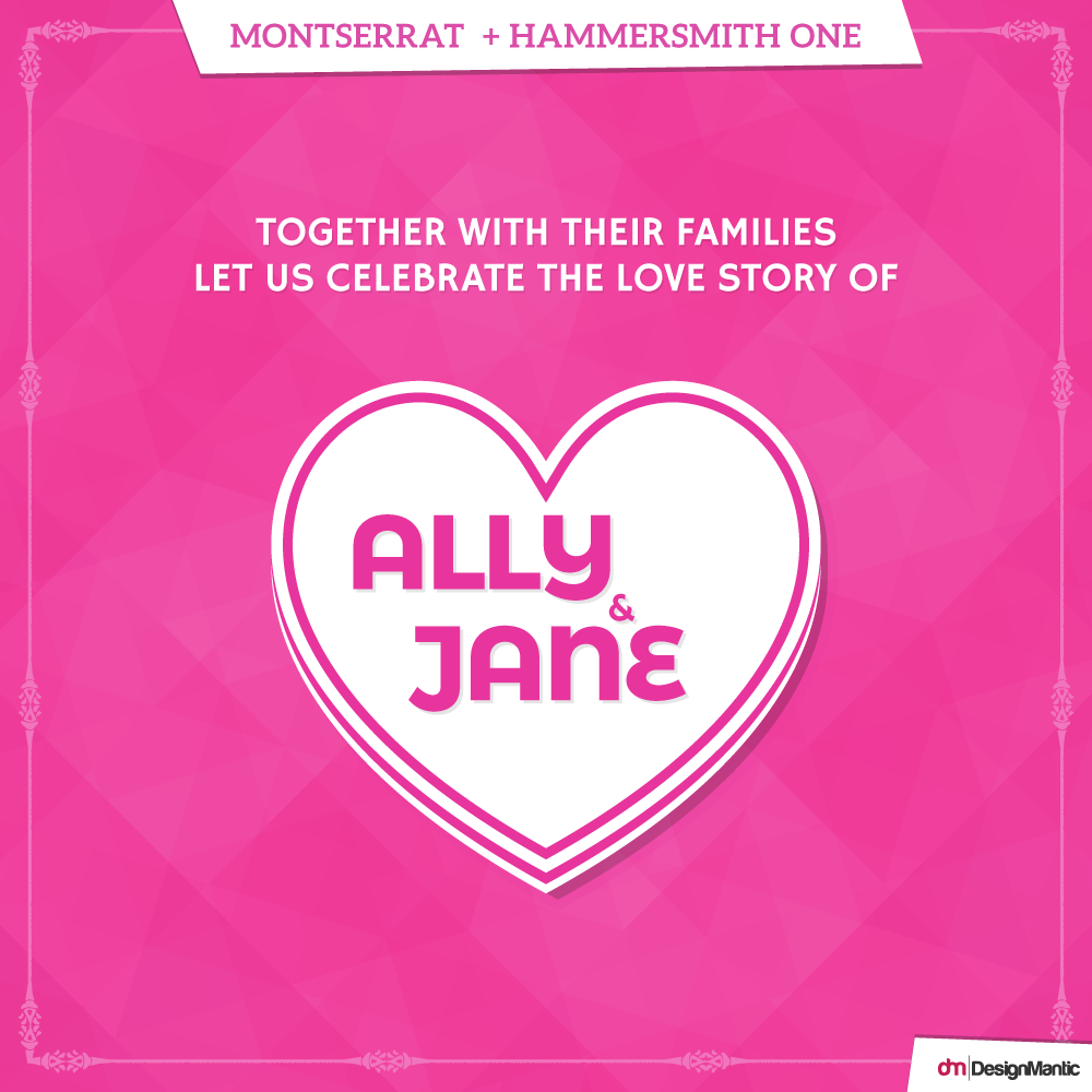
5. Montserrat + Hammersmith One
In the previous designs, we have used Montserrat in supporting roles, but remember that it fares just as perfectly in the lead. In this wedding invitation font pairing, Hammersmith takes on a bold physique, and so does its contender font; Montserrat! Inspired by the Johnston UK lettering tradition, Hammersmith One depicts the quirks of a somewhat handmade, naïve, brush written letters, in addition to dark joins between strokes.
Any other font might have competed in hierarchy or appeared overpowering, but the weight of the Hammersmith One pulls off the pairing to perfection. Together, two strong fonts stand out and appear rather classy.
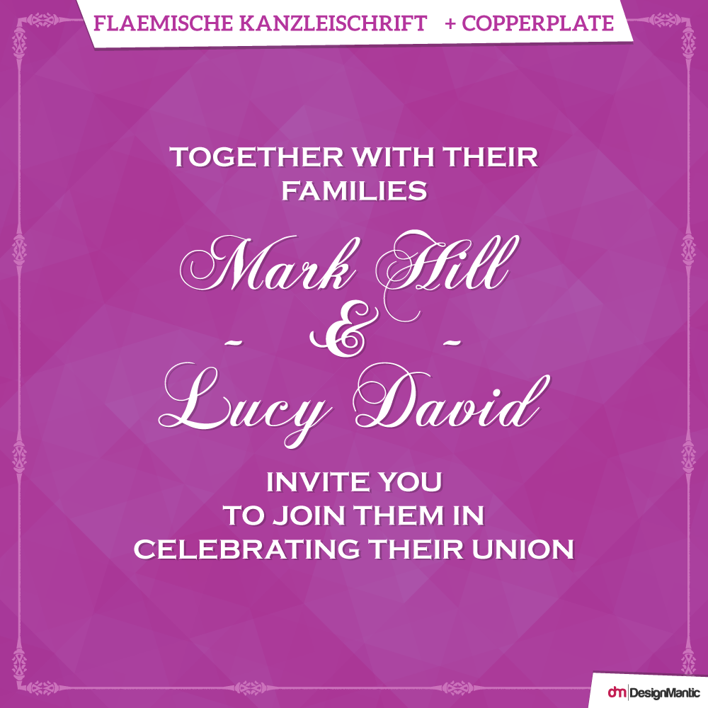
6. Flaemische Kanzleischrift + Copperplate
Flaemische Kanzleischrift tips its hat off to being designed by a skillful penmen. Initially derived from hundred-year-old manuscripts and later transformed into digital form, it incorporates a sense of hand lettered traditions that infuse a feeling of prestige and elegance to any design. Copperplate Gothic on the other hand was designed in 1901 by Frederic W. Goudy. The term “Gothic” classifies the font as a sans serif. However, glyphic serifs are employed to adorn its subtle strokes.
The font has an air of Victorian display meets stone carving, making it an elegant and timeless choice for wedding invitation font combinations. The subtle richness and extravagance in design of Copperplate, beautifully go well with the delicate and ornate curves of Flaemische Kanzleischrift, making for a fanciful and rich look.
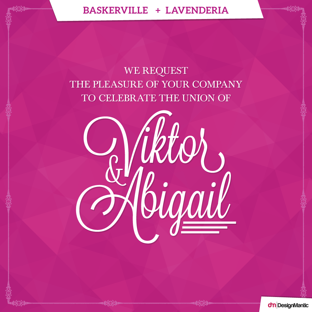
7. Baskerville + Lavenderia
To herald your fairytale wedding, this wedding font combination spells classy and contemporary in the same breath. Lavenderia is the darling of the dance here; more than a little retro and perfectly swashed. To steer clear of the outmoded “wedding invitation” style of script, the designer of Lavenderia, James Edmondson, has altered the fundamental traits of the font; the width, the x-height, and the slant of the letters.
Libre Baskerville, on the other hand, may be mostly wall flower, but it’s Clark Kent qualities don’t sabotage its good looks. Its firmness and stability is just what is needed to anchor this flighty design.
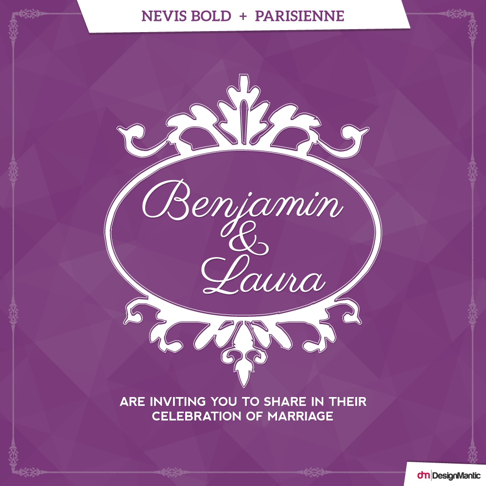
8. Nevis Bold + Parisienne
Inspired by the Bra advertisements of the 60’s, Parisienne is a casual connecting script. Its intentional irregularity and slight bounce steers it clear of becoming a more formal script font. Free spirited yet classic, its romantic swashes are tempered by the steadfast characters of Nevis Bold in this design. Nevis is an angular, strong typeface. It’s bold and assertive, but manages to preserve a friendly tone.
Nevis is strongest in all caps, while Parisienne shines in title case. When additional spacing is incorporated between letters of Nevis Bold, it is rendered almost indistinguishable from its more pricey contenders like Gotham. Give this gorgeous wedding font pairing duo a whirl if you are looking for a wedding invitation set to wow!
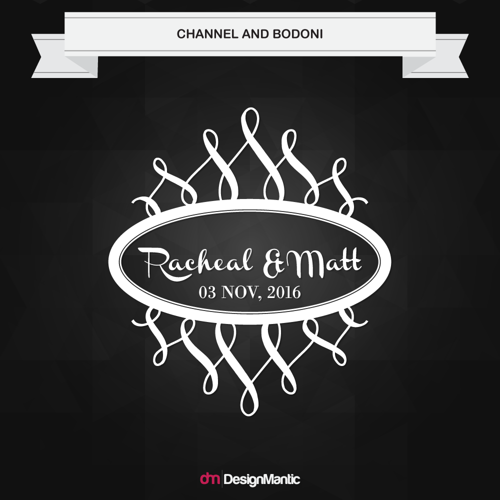
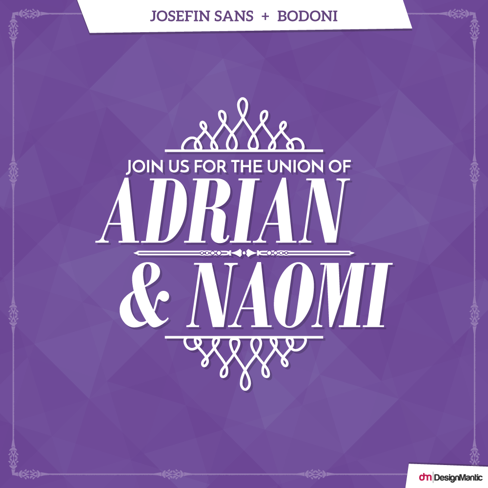
9. Josefin Sans + Bodoni
Bodoni is a rather modern font, characterized by completely flat serifs and a high contrast between the thin and thick strokes. The Bodoni font embodies the rational thinking of the Enlightenment, and the strength of its characters renders it easily distinguishable.
On the other hand, Josefin Sans is a vintage inspired, geometric font. The geometric styling and the unbracketed serifs has made this font popular in most kinds of typesetting situations. The duo is a vintage contemporary pair that is great for designs that are impactful and memorable, yet simple.
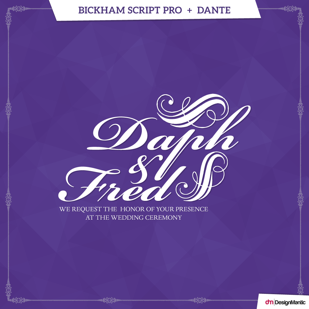
10. Bickham Script Pro + Dante
Released in 1997, Bickham Script is a timeless font, penned down by Richard Lipton. The font has its roots all the way back in the 18th century English handwriting, but now each letter has been given a humanist touch. Bickham has an air of affluence and elegance that would make your wedding stationary appear to have been designed by a professional scribe.
Dante, on the other hand, was designed by Giovanni Mardersteig after World War II. Since then, it has been adapted to a more digital format, apt for periodicals and magazines. The rounded elegance of Bickham provides a sharp contrast to the mechanical perfection of Dante. The breathtaking wedding font combination marries modern taste with sheer grace.
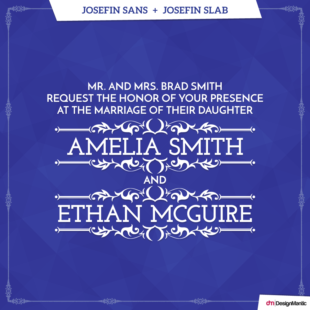
11. Josefin Sans + Josefin Slab
This wedding invitation font pairing is the perfect testament to the fact that you don’t need to look for love; it might be right under your nose. In this case, the perfect font pair might be right next to each other in the font menu, and we are bound to let it slip.
Josefin Slab and Josefin Sans may be from the same family, but with the right formatting of text, spacing, and ratio of sizes, the two types can nuance each other as if they’re from different font families. Incorporating typewriter style attributes, Josefin Slab is a Scandinavian style font that complements the more vintage like feel of Josefin Sans in any wedding related stationary.
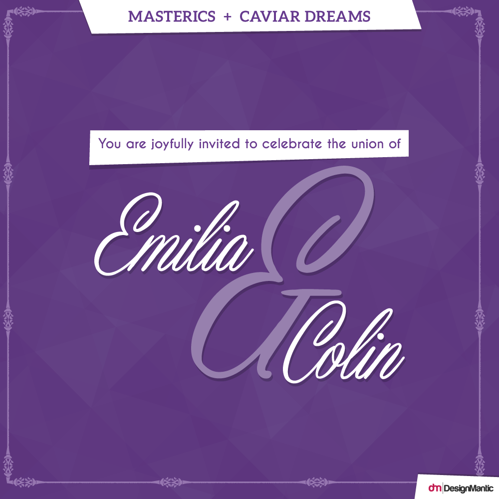
12. Masterics + Caviar Dreams
Masterics is a contemporary calligraphy, imbued with a vintage feel due to its elegant touch and moving baseline. Caviar dreams, on the other hand, is characterized by the unconventional shapes of its letters; shapes that stay clear of those classic renditions, allowing Caviar Dreams a unique identity altogether.
Its congruent letter spacing is a blessing for the eye, and seems to be binding the design together.
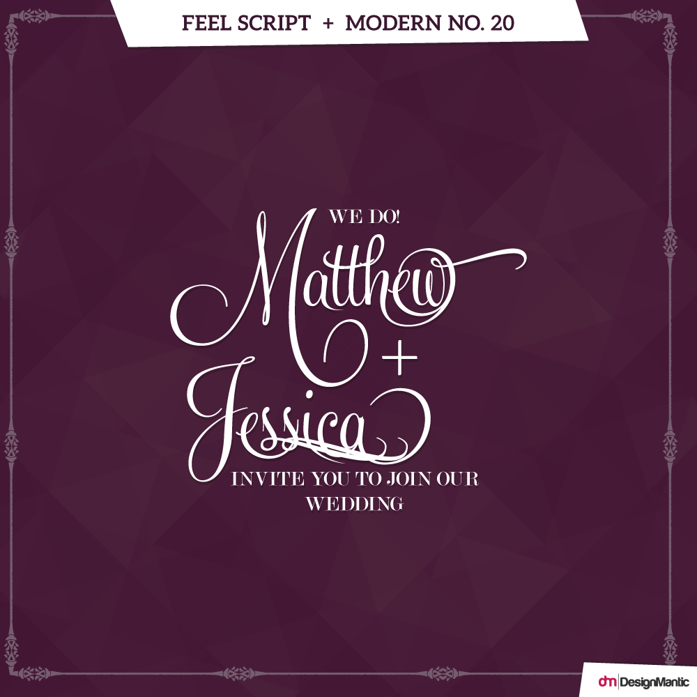
13. Feel Script + Modern No. 20
Feel Script is based off an older font which was created originally for Intertype. Most of the letters in the font were sampled originally from the vintage American magazine ads and later translated in to the digital form needed today. Feel Script comes with potent features and a more feminine legacy.
Modern No. 20, on the other hand is deemed a title face, apt for magazine covers and headlines. This modern serif, designed by Stephenson Blake, is a commendable typographical shorthand for refinement and quality. The digital version works impeccably in body copy, showering each word with equal importance without shouting. No other font can be a better masculine counterpart to our delicate Feel Script; a match made in heaven!
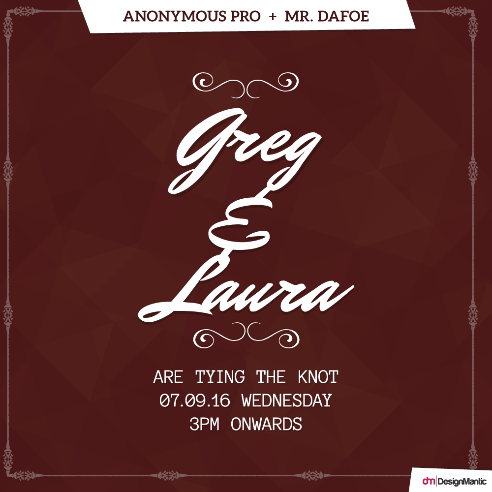
14. Anonymous Pro + Mr. Dafoe
Distinct calligraphic fonts like Mr. Dafoe should prudently be used across short lines, so that they don’t make the design appear cluttered and busy. By blowing up the headline size, it was used as the central design element in the wedding invite shown above.
The secondary font, Anonymous Pro has been given the role of a contrasting font; it grabs attention and complements the bold and swift strokes of the main font while sitting in the background.
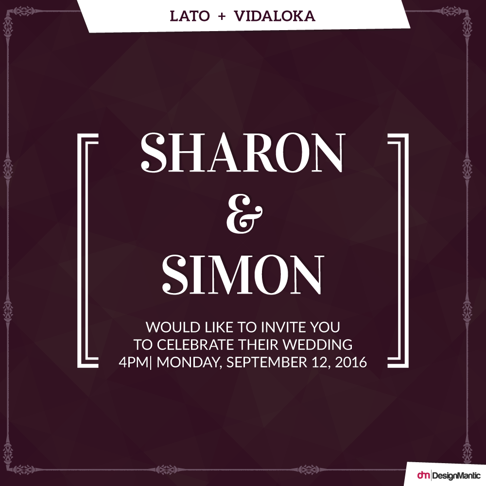
15. Lato + Vidaloka
Akin to Bodoni, Vidaloka is a modern-type serif font, only a bit wider and thicker set than the former, and characterized by sloped terminals and curlified drops. If your design incorporates bold illustrative elements, it must be complemented with a strong headline font, otherwise the text would be lost somewhere in the invite.
Due to its high contrast, Vidaloka works best for short blocks of text. The simplicity and lightness of the complementary warm-feeling font, Lato, softens the design. Lato, Polish for “summer”, feels very unassuming and modest when set at small sizes in body copy.

