How strong is your wanderlust? Do you feel the nature calling, urging you to pack your bags and head out in the wild, with the wind whipping at your face, sparkling waves lashing at your feet? However, while travelling, it is not uncommon to feel out of touch with the people you would usually spend a better part of your time with. When you’re on vacation, enjoying who you’re with, learning new things, making new friends, exploring new places, and where you are is the overall part of the experience. Disengaging from your social media newsfeeds and cell phones is the most viable way of immersing yourself head over heels in your new adventures.
However, it doesn’t mean that you disappear off the radar and avoid all forms of communication. This is where travel postcards come in to the picture. Postcards are a fun and heartwarming way to keep in touch with loved ones back home, let them know what you are doing, where you are, without feeling the need to bury your face in your cell phone. No matter where you go, you’ll come across a plethora of postcards pertinent to your destination, which you can send to your loved ones and make them feel a part of your adventures. Here, we have collected some stunning travel postcard examples from topnotch platforms for world’s best designers to stir your travel nerve:
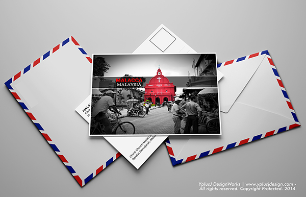
1. Malaysia Postcard Designed By Jasreen Rubeni
Malacca has been capitalizing on its swashbuckling history in the last decade, asserting itself as one of the most irresistible tourist draws of Malaysia. Being one of the oldest functioning Protestant churches in Malaysia, tourists possess a fanatic interest to visit Christ Church Melaka because of its historical background that is dutifully and diligently kept alive to date. In order to embody the essence of Malacca, the artist Jasreen Rubeni has beautifully imbued a burst of color to the picture of the church, against a grey scale background. The nostalgic postcard design is a testament to the fact that the distinctive reddish color of the church has dominated the landscape of Malacca for decades! Hats off for the touch of subtlety by the designer.
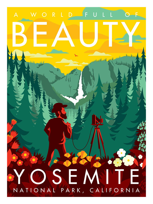
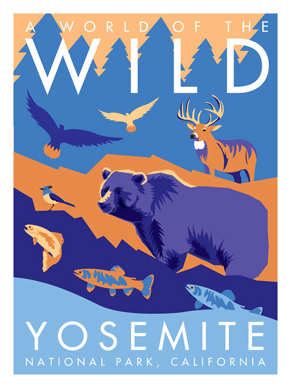
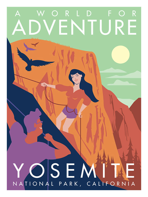
2. 5 Postcard Concepts For Yosemite National Park By Viet Triet Nguyen
Lying at the heart of California, Yosemite National Park is an icon of America’s majestic natural beauty, welcoming millions of visitors every year, who are drawn to its abundant wildlife, hanging valleys, ancient giant sequoia trees, polished domes, dramatic waterfalls, cirque lakes, and jaw-dropping cliffs, such as El Capitan and Half Dome.
The 5 postcard concepts designed by Viet Triet Nguyen beautifully incorporate the essence of visiting the National park. Each postcard highlights a particular aspect of Yosemite; the amount of exploration, the living wild, the great adventure, the obvious beauty of Yosemite, and the potential holiday that awaits the visitor. Looking at these travel postcards examples of the Yosemite National Park, it’s hard not to get swept up in the spirit of adventure.
Related: Branding In The Travel Industry: Nailing All The Elements Right
3. Hawaii Postcard From Jad Abou Zeki
Rushing waterfalls thundering head on into sparkling freshwater pools, and islands redolent with the fragrant scent of flowers, the ‘aloha’ state is unparalleled in breathtaking beauty and abounding natural treasures; from its rainbow arches, emerald valleys, to sapphires seas.
The energizing wafts of the fresh, floral air, the invigorating freshness of tranquil, warm waters, and the revitalizing aura of resplendent beauty is easily reminiscent in this beautiful postcard design by Jad Abou Zeki. Employing the vibrant tropic colors, the images of a setting sun, open sky, sparkling waters, sandy beaches, and palm trees, one yearns to be a part of this serene, picturesque scenery. There is no place like Hawaii, and this postcard doesn’t fail to revive our memories.
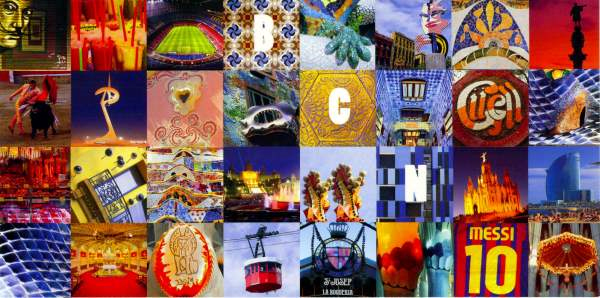
4. Barcelona Postcard By Virginia Stuart Taylor
Flaunting scrumptious culinary options, crazy festivals, and mesmerizing flamenco dancers, Spanish culture is anything but boring. What most stands out about this postcard design isn’t the kaleidoscope of colors, but the contrasting textures dancing with each other throughout the design. Barcelona is completely at odds with any other Spanish city and Gaudi’s influence and the plethora of his wacky architecture is partly responsible for this.
Despite the fact that this city is always teeming with tourists and boisterous throngs, the city is thriving with activity at any time of the day. Barcelona has so much “going on” at every turn and the vibrancy is contagious; it’s like Spain running on an overdose of caffeine. This travel postcard example by Virginia Stuart Taylor beautifully incorporates the bursting energy and scintillating brilliance of Barcelona, with a collage that embodies all that the city stands for! Just looking at the postcard makes your blood rush!
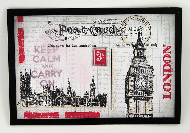
5. London Postcard Designed By Suzanne Czosek
Not just notorious for its bleak, overcast skies, the city is a treasure trove of some of the most historic monuments, such as the Big Ben, London Eye, and the Tower Bridge, and a rich history, resplendent with culture, chivalry, and utter grace.
In this postcard for London, Suzanne Czosek has blended together images from Ephemeral Backgrounds, London Underground, and Loverly London to create a fun and inventive postcard. The background has been stamped using a grey dye ink and a ledger stamp. The Postcard stamp across the top has been embossed with black ink, and the lines have been hand drawn with a ruler to separate the sections. The tower is lightly colored with a light coppery brown and stamped in black ink, while the word ‘London’ is stamped in red ink. The red lines on the side and bottom are extracted from the Underground stamp and masked off by the designer. A light coat of white paint has been smeared over the top, which pulled some of the red into the postcard to create a distressed effect.
Everything from the elegant scrawl of the background, to the vintage fonts and hand drawings, looks very old school, nostalgic, and antique about this postcard; In a nutshell, everything that London stands for is covered through the comprehensive travel branding of the renowned city.
6. Atlantic City Postcard By Vernon Nash
Known for its boardwalks by the sparkling Atlantic Ocean, endless stretches of white sandy beaches, and its opulent casinos marking the skyline, the resort capital provides the ultimate reprieve for tourists. In this post card designed for the Atlantic City, the designer aspires to appeal to an older crowd, pining for the good old days. As is perceptible from the postcard design, Vernon Nash is attempting to play on the nostalgia of a vintage memory customer by basing the type, color palette, and composition of the postcard off old touristic style postcards. This communicates a stronger message to the Atlantic City during the holidays, which is exactly what the designer is hoping to portray.
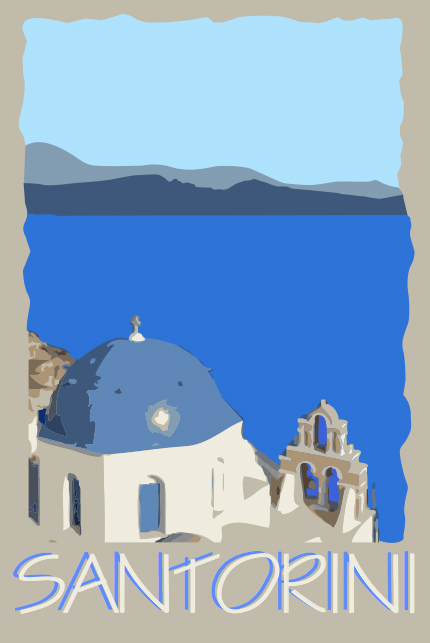
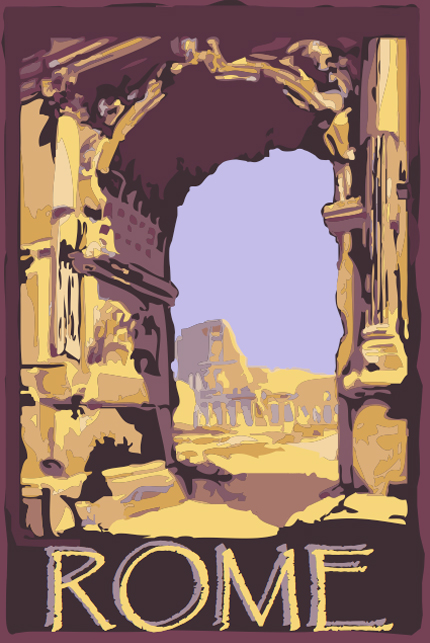
7. European Postcards By Kathryn Straub
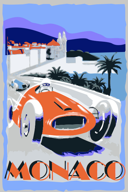
Venice is the consummate magician according to those who have seen it. It transforms the most pedestrian of people into masked, fantastical creatures, makes marble palaces disappear into silent fogs, and labyrinthine calli (streets) vanish at the caprice of moody tides! While the Crescent-shaped Santorini lets the tourists delve in the exquisitely clear waters in the middle of the sea, perched on the lip of a gigantic active volcano. Lose yourself in the tangled lanes of the neighborhoods like Monti and Trastevere, or historic centers in Rome, or enjoy an opulent beach holiday in Monaco; the charms of Europe are far and many.
Kathryn Straub has designed a series of four postcards based on her wide travels and joyous experiences in Europe, and what she loved about each city. Each postcard perfectly embodies the essence of each city and what it promises for the tourists. Everything from the color palette to the Typography seamlessly integrate in each postcard design and blend in well with the images!
8. Philippine Postcards By Tish Valenzuela
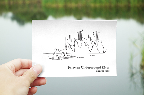
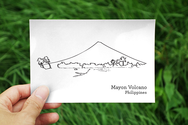
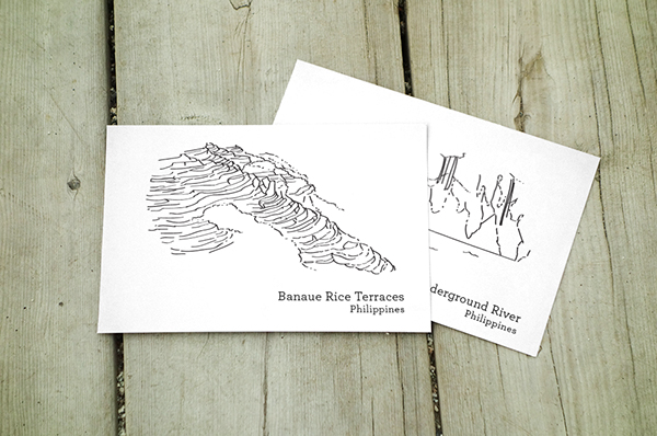
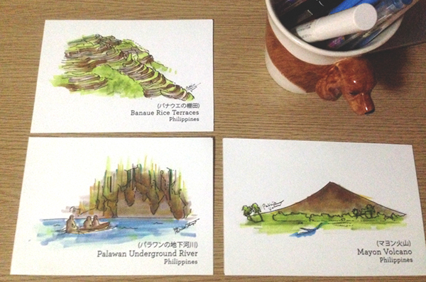
While Philippines is home to a plethora of breathtaking natural wonders, and defined by its fuzzy water buffalo, bug-eyed tarsiers, smoldering volcanoes, imposing rice terraces, graffiti-splashed jeepneys, teeming mega-cities, emerald rice fields, meandering rivers, and smiling, happy-go-lucky people, these postcard designs by Tish Valenzuela wish to strip away all the graphic embellishments adorning the surface of most local postcards, and render a simple twist on capturing the essential beauty of each awe-inspiring destination in Philippines!
The simple hand-drawn imagery, decked out by the most natural colors, and labeled by the destination they represent, allow the recipients to glimpse a sneak peak in to what the destination promises. Next time you decide to venture into the Philippines, be sure to take a few with you and send to your loved ones back home to let them be a part of your adventures.
9. Tangram States Postcards By Christopher Jobson
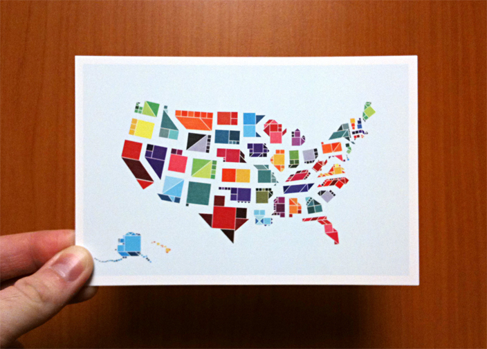
Who would have guessed that the map of American states can look so creative? This American post card design by Christopher Jobson employees the tangram to constitute all the states. For those who don’t know what a tangram is, it is an ancient Chinese dissection puzzle consisting of flat shapes, known as tans, put together to form unique shapes. Given the unique disposition of each state and the diversity of its people, it’s only fitting that each state is represented in all its uniqueness!
10. Israel Postcard By Lori Palmer
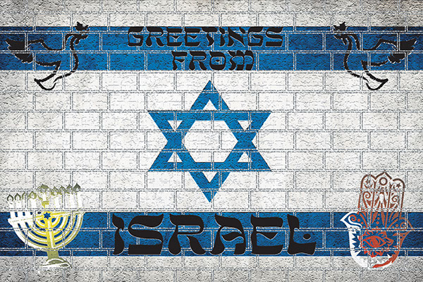
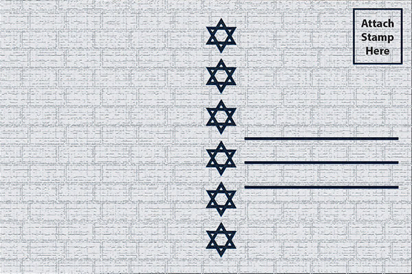
Home to some of the most famous historic sites in the world, Israel Territory is often thought of as a pilgrimage destination in all its simplicity. After all, this is where some of the most significant events for those of the Christian, Muslim, and Jewish faiths are said to have happened. Beautifully depicting the Star of David between horizontal blue lines to hint at the Israeli flag, Lori Palmer has done a great job of designing the postcard of Israel. Since Israel has recently become a “birding superpower” and an entirely new recreation culture has been born of the love of the birds in the country, the post card design also features images of birds at the top of the post card.
11. New Zealand Postcard By Lisa Stark
As the planet continues to heat up politically and environmentally, it’s great to know that New Zealand exists. This peaceful, green, accepting, and uncrowded country is the ultimate retreat for tourists. This nation is loved by tourists for its picturesque landscapes, including bottomless fjords, sandy beaches, glowworm caves, geothermal hot springs, rolling hills, awe-inspiring glaciers, crystal-clear alpine lakes, pristine beaches, snow-capped mountains, and volcanic plateaus. The hedgerows and rolling undulating hills collude with the easygoing, irreverent locals to delight, distract, and disarm, and grandest vistas in the wilderness loom over serene, iridescent waters as chaperons.
Presenting the best of both new and old worlds with environmental and social sensibility, the postcard design couldn’t have provided a better template for representing New Zealand. A haven of beauty by the day light, and a kaleidoscope of night life activity after hours, the post card design by Lisa Stark does a great job at depicting the multiple facades of the country. Incorporating the colors and patterns of the New Zealand flag in the letters of the country is a stroke of genius by the designer.
12. Thailand Postcard By Charlie Yllobre
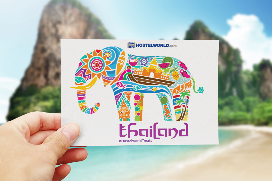
Historic and cultural, tropical and exotic, and fun loving and friendly, Thailand emanates a golden hue from its tropical beaches and glittering temples through to the ever-comforting Thai smile. Be it a soiree on the white sandy beaches, ancient ruins, or luscious jungles, a thriving night out in Bangkok, sensory overload of a busy morning market, encounters with cultural abundance and historical monuments; the country is a blend of the new and the old at every turn.
Employing the most important figure in Thai society and a significant symbol for many centuries, the stunning postcard design by Charlie Yllobre fits in all that we hold dear to Thailand in the shape of an elephant! Blue sparkling waters, Buddhist temples, water melons, pineapples, boat houses, flip-flops, palm trees, a brilliant kaleidoscope of vibrant colors, coconut water, chop sticks, surfs, and tropical flowers; can you think of anything else that reminds you nostalgically of Thailand! Even the Font used by the designer to write ‘Thailand’ speaks exotic at every quirky turn of the letters. All in all, a breathtaking postcard design!
13. Indian Postcard By Stepani Shcheva
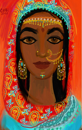
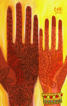
A country steeped in traditions, India has always been fondly remembered and exalted as the country of a rich heritage, symbolic colors, and a culture brimming with symbology. To an outsider, India’s colorful stories, culture, and streets might seem like a page out of an ancient book, but in essence, color has always been a significant aspect of Indian consciousness. India bedazzles and charms all and sundry with a kaleidoscopic rendezvous, and so do its postcard designs.
Characterized by beautifully skinned women clad in stunning gold adornments, chin tattoos, intricate henna patterns, exquisitely embroidered embellishments, kohl rimmed eyes, multi-colored bangles, and the beautiful “bindi”, these postcard designs by Stepani Sccheva truly reflect some of the most gorgeous aspects of India. The vibrant hues and striking color palettes employed resonate deeply with the Indian culture and heritage.
14. Japan Postcards By Arianne Ardenaso
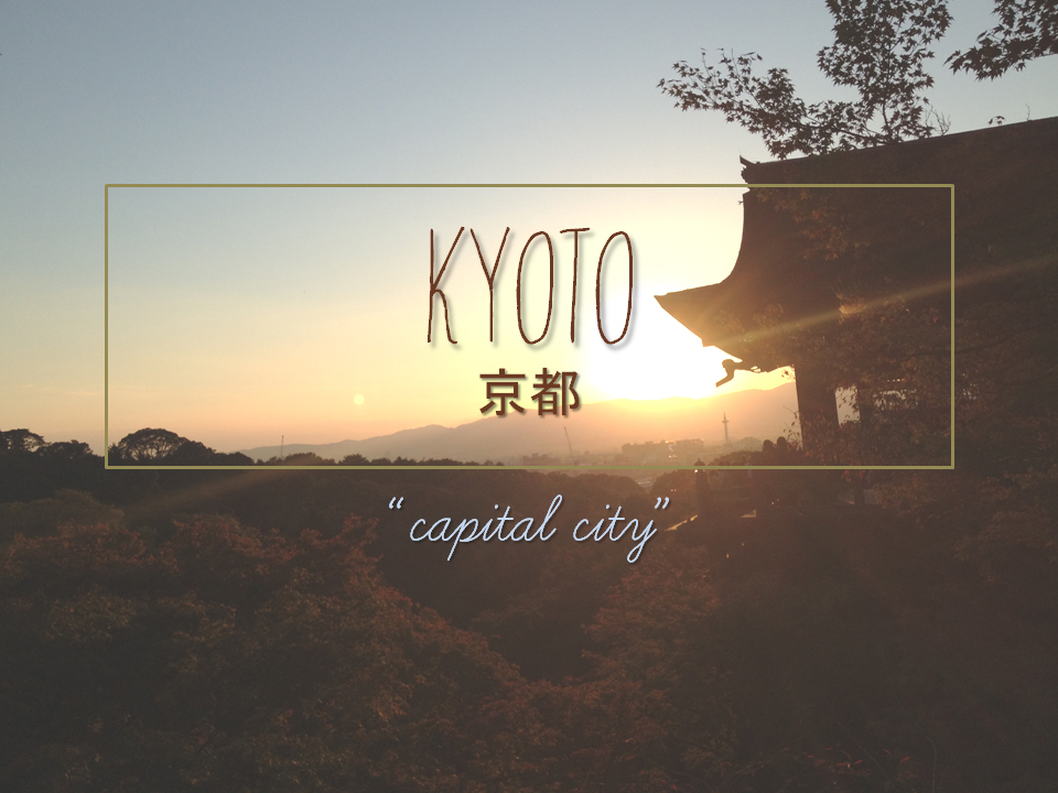
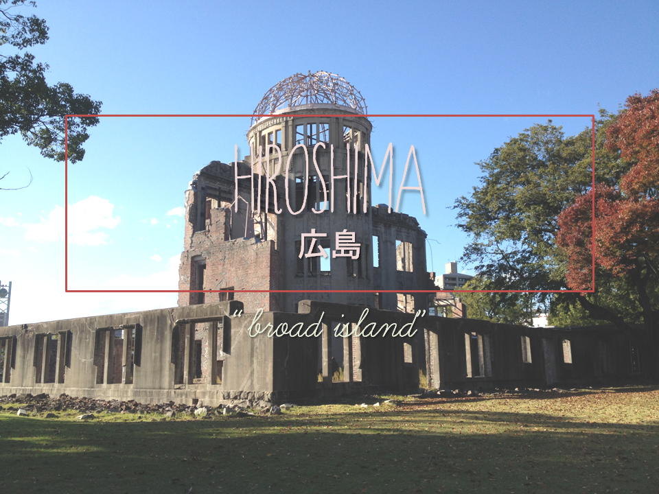
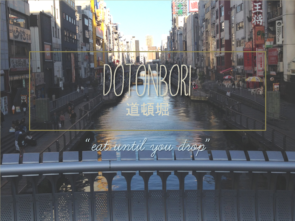
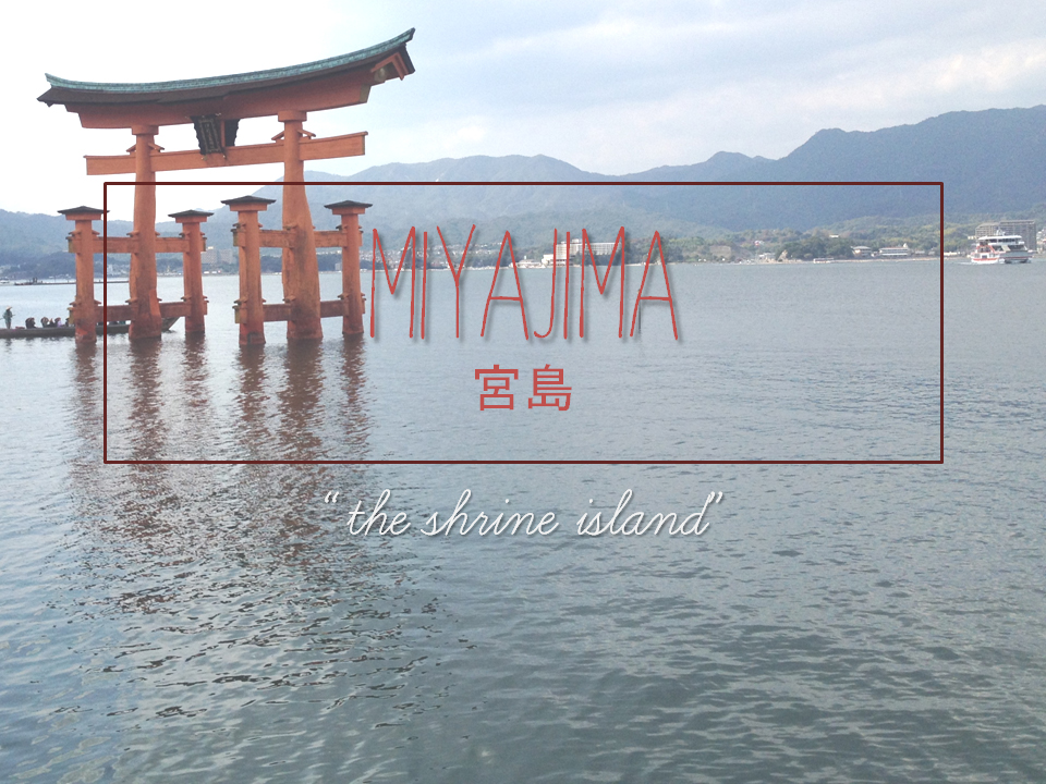
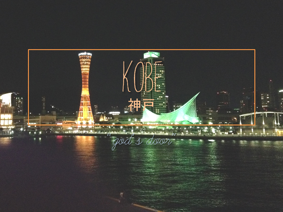
No matter how far and wide your travels have taken you, Japan is a world apart – a cultural Galápagos where centuries past a unique and exquisite civilization blossomed, and thrives today in delectable contrasts of modern and traditional. The Japanese spirit is warm, strong, and incredibly welcoming. This is exactly what the designer Arianne Ardenaso hopes to exhibit in her postcard designs for Japan. Employing high resolution photography to highlight the main attraction and the most optimum visiting time of each city, the designer has also incorporated a tagline to best describe each city to tourists in her postcard designs. The ancient script like lettering and the color of the font blend in perfectly with the background and the ambience of the exotic country.
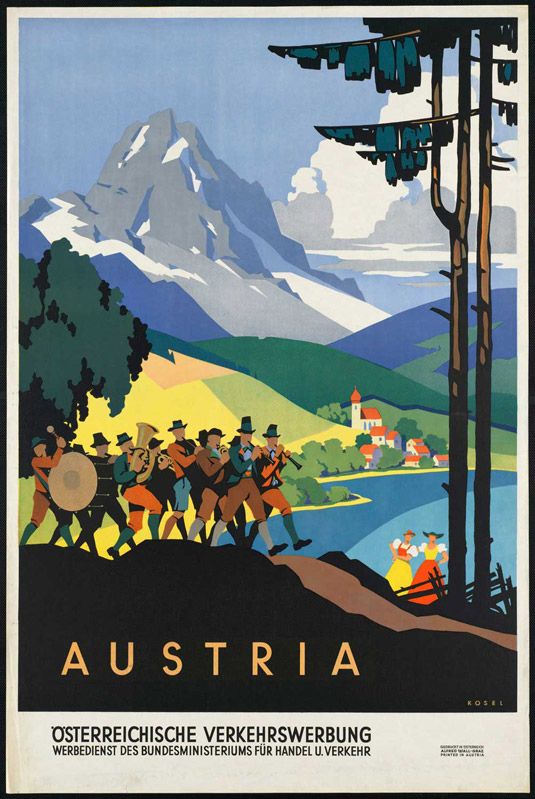
15. Austrian Postcards By Hermann Kosel
Austria is a country rich with activities, beautiful places, history, and traditions that are distinct to the area. Designed by Hermann Kosel, the postcard depicts a group of hikers enjoying the breathtaking mountains of western Austria. The use of natural colors and vivid imagery goes to imprint an image of the mountainside of beautiful Austria in the minds of the recipients.
Are you an avid collector of postcards? Do send us your favorites and we might just include them in our post! Bon Voyage!


