“The principle role of a logo is to identify, and simplicity is its means…Its effectiveness depends on distinctiveness, visibility, adaptability, memorability, universality and timelessness.”
– Paul Rand
The genius behind the logos of some of the most iconic brands like IBM and UPS couldn’t have said it any better. Even the most basic elements of design may seem overwhelming for a lone graphic to carry on its own. However, it is these aspects that also make the establishment that it represents shine. The logos of educational establishments are a case in point. With so many rival academic organizations vying for attention, it becomes necessary for them to make themselves more visible.
Suffice it to say, the logo of an educational institute must not only be well designed; it must also make it stand out. The designers who are responsible for such tasks know this for a fact. In this post, we discuss 10 logos that capture the mission of the academic organizations that they represent. A couple of them sport online logo design that are not only creative, but innovative in their concepts as well.
Top 10 Education Logo Designs
Here is a compilation of 10 of the best logo designs of educational establishments –
1. ‘The University Of Texas’: Adopts A Refined Design
Twitter: @utaustin
The ‘University of Texas in Austin’ sports a logo that is hard to miss. If you take a look at their logo, you can see that the designer has included the institute’s academic symbol in the design. The symbol is derived from university’s official seal so its addition is a clever touch. Plus, the choice of typeface goes splendidly with the burnt orange color and really draws the eye.
2. ‘UIC’: Goes Vertical
Twitter: @thisisuic
The ‘University of Illinois at Chicago’ has a logo that is vertically inclined. You may have to tilt your head sideways to make sense of the lettering. However, look at it long enough and you will see that the designer has cleverly emulated the Chicago skyline in the design. The UIC lettering at the bottom also adds a bit of pizzazz to the design by emulating an exclamation. This is a pretty creative way to pay homage to UIC as a big city university.
3. ‘Ryerson University’: Uses Color To Its Benefit
Twitter: @ryersonu
The logo of ‘Ryerson University’ incorporates blue and gold colors which make for a bright palette. This shows good insight and understanding of important factors of an educational logo design on the designer’s part. The bright visuals draw attention especially since the yellow bar seems to hover above the typeface. The typeface itself is also pretty decent and overall, the effect of the imagery is pretty easy on the eyes as well.
4. ‘Boundless’: Goes Modern
Twitter: @GoBoundless
Designers who want to know how to add finesse into logo design should take a page from the ‘Boundless’ book. If you look at their logo, you can see that the symbol open books. This seems to emphasize on ‘Boundless’ as an educational venture. The light colors provide excellent eye candy. The typeface does well to mimic the light design as well. In the end, the design of the logo is simple yet effective enough to make you take notice.
5. ‘HSB’: Keeps Its Logo On Point
Twitter: @HS_Bremen
You can see that the designer cleverly incorporates the abbreviation ‘HSB’ in the logo of the ‘Hochschule Bremen City University of Applied Sciences’. It takes center stage. It was also thoughtful of the designer to spell the full name of the institute below. And the geometric shape in the key imagery is a nice touch since it is indicative of the city’s coat of arms.
6. ‘Debroc’: Adopts A Straightforward Design
Twitter: @DeBrocBusiness
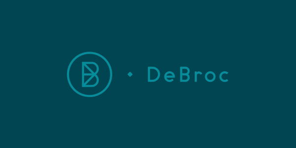
‘Debroc’ is a business school and the designer who was responsible for this logo clearly took that aspect into account. The variety of typeface in the ‘Debroc’ logo adds a nice modern touch. And a corporate color pallet perfectly represents the serious ambience of a business school as well. The monogram is a mesh of the letters “D” and “B” which works quite well for a abstract minimalist logo.
7. ‘ArtCenter’: Goes Big On Orange
Twitter: @artcenteredu
The designer responsible for the ‘ArtCenter’ logo incorporated a large orange dot to make the design stand out; and it works! The black Neue Haas Grotesk word mark at the side also makes both the text and symbol work together to form a logo that is truly unique. Again, you got to love that orange. It seems fitting for a design school.
8. ‘The Gotham Writers’: A Logo Or A Work Of Art?
Twitter: @gothamwriters
‘The Gotham Writers’ is a community of writers. If you look at this logo, you realize that designers can achieve more with a lot less. See how the letters “W” and “G” come together to form a tip of a pencil. This is an innovative touch especially if you take the writing community’s mission into consideration. Plus this symbol can easily be used as a standalone component without the full lettering beside it as well.
9. ‘Liverpool Guild Of Students’ : Flag Logo
Twitter: @LiverpoolGuild
The ‘Liverpool Guild of Students’ is a student’s union whose main purpose is to attract students to boost their skills. The designer who created this logo clearly had this aspect in mind since the design looks like three flags or a signpost. The spaces between each of the three bars are equal to the thickness of the mast which adds symmetry. And the bars can be colored any way which makes for a very flexible design. Imagine how good it would look like on a poster or letterhead.
Related: Designing An Education Brand That Resonates With Kindergarten Audience
10. ‘Martin College’ : Puts The “M” In Marketable Logo
Twitter: @Martin_College
The designer who created the logo for ‘Martin’ college proves that even a single component of a logo design may speak volumes if it is implemented well. Take a look at the “M” in this design. Doesn’t it look like an open book? Or does it signify “M” for Martin? The interpretation is left to the audience; a pretty innovative use of imagery, don’t you think?
Most educational establishments opt for logos that represent their values the best while others prefer a number of fonts or modern styles to make their logos stand out. In the end, it is the skill, knowledge and foresight of designers that determine how effective such logos are. The designers mentioned above certainly have what it takes.


