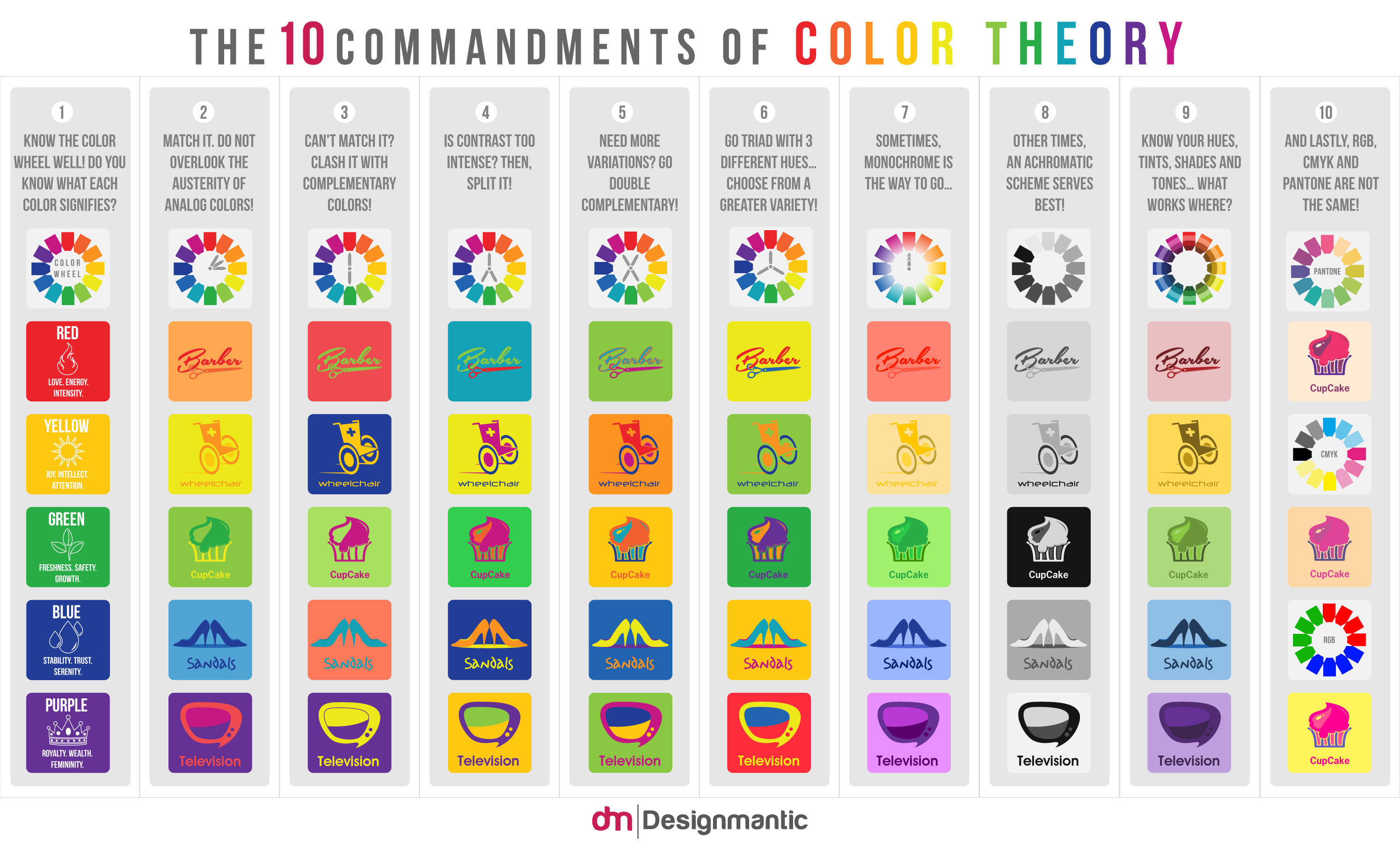
Here come the 10 cardinal rules of color scheming to help you save time when choosing colors. These essentials serve as bedrock to the color-verse…
After the eminent success of our previous infographic, “ The 10 Commandments of Typography ”, DesignMantic now brings to you its sequel created upon popular demand! Enter, “The 10 Commandments of Color Theory”…
This infographic holistically sums up the 10 cardinal rules of color scheming to help you save time when choosing colors. A lot of people find themselves at a dead end in their attempts of defining color schemes and combinations. The infographic below, hence, dishes out for you the 10 essential points that serve as a bedrock to the colossal color-verse!
The use of right colors can have a great impact when creating an online logo design. Thus, we need to be extra diligent when picking colors for our logo, according to the industry the business is operating in.
With the help of this detailed visual, you’ll be able to understand and learn the rules to create harmonious color schemes. It provides to you an understanding of the different features of a color spectrum like the different hues, tints, shades and tones.
Please feel free to drop your comments below and give your views on these 10 points. Do let us know how you like it!
Embed in your site:
It’s noteworthy that color theory is used not only in Logo design, but also in website design as well. It’s impossible to create a stylish and harmonious website without paying due attention to the selection of website colors. This takes into account not only the colors of individual design elements, but also the images that are located on the page. There is a comprehensive WebBuildersGuide available that can help you pick and choose the right color for your website.


The more I study color theory the more I think it is analogous to astrology. (But I’m a virgo- of course I would say that)
Nicely designed infographic. Thank you for posting!
Brilliant! Love it, Have printed this the one on Typography and posted it on my wall in the office. Best guide to colors and fonts I’ve seen. This is now my goto reference when designing my poster ads on social media … in fact for every design I do from now on! As a Branding and Media photographer this info is gold and allows me to make quick and informed decisions quickly and accurately. Thanks Evan, you rock!
Interesting take on the use of colours. As one who was once a sign maker and designer for industrial signage, I can appreciate the importance of catching one’s eye. Now, as a grade 4 teacher, with my students creating posters and, now more and more, visual media with our classroom set of iPads, the idea of CONTRAST sticks out to me the most. So often the untrained 9 year old eye will arrange yellow text on top of a white background, or dark blue on a black back ground. When I ask them to have a colleague hold their creation a few feet away from their eye, I ask them what it says, and they say “ooo, it’s hard to read yellow on white.” Then comes the teachable moment about contrasting colours. Then when one student gets it, it starts to spread to the others organically. Your graphic would be great to put up in my room for reference, as my students evolve as creators. It will serve as an effective tool to understand contrast as well as see other colour combinations that one wouldn’t put together naturally on their own.
I would love a high res of this to post in my classroom! What a great resource! Let me know if I can buy it! 🙂
Thanks for sharing this. I have to say its one of the more colourful infographics I have sen in a while…
Terrific graphic.
Extremely helpful reference, thank you for making it available to the community.