The true essence of life, joy and energy in this world is enhanced through colors. Everything that is colorful seems to have a meaning, holds a different story for every eye that beholds it. Everything the light touches and changes their dark shades into lighter and more brighter tones tells us that having colors in our lives can change everything, from perspective to entire situations and their impacts. Colors enable us to see things better, to understand the meaning that is supposed to be conveyed by mere objects.
Brands with Great Colors:
There are many brands that have made it on the mark with their perfectly created logos that have not only captivated audience in their cities, but all around the world. Such logos define how color can really make everything better. Here are a few brands which have chosen their logo colors wisely:
APPLE: By using just the silver color in their iconic yet simple image of an apple, this company has got the best logo, as everything about it says just one thing: elegance. Apple’s products are in a class of their own, and so is their logo.
MCDONALDS: Another universally known logo that stands out because of its perfect color combination is McDonald’s logo. With the M standing tall against the blue backdrop of the sky highlights; the fun in its yellow is easily visible, not to mention absolutely memorable. The combination of Red and Yellow invigorates a tantalizing image of warmth and, of course, tasty food, in the minds of its customers.
CADBURY: The deep purple used by Cadbury gives off the message of quality, luxury and decadence, everything that it promises in the taste of its chocolate bars. Contrasting with the dark brown of the candy bars, it has an overall attractive, luxurious look.
STARBUCKS COFFEE: Known well across the Globe for its fantabulous coffees, the Green Siren in the Starbucks Logo is significant with their environment-friendly themes. Also, the color Green is associated with youth and those who enjoy life, so it’s an attraction for all ages of coffee drinkers.
NICKELODEON: The Kids’ favorite channel has a logo that is a splash of the fun color i.e. Orange. In the midst of the Orange splash the words are written in a Neutral color which creates a well-balanced contrast and perfectly gives off the feel of playfulness and enjoyment, which is what the channel is all about.
Small Businesses Who Got Their Colors Right:
The brands that have stood the test of time, they all have one thing in common; great logos. But let’s see how businesses that are not that huge have got similarly pretty logos with perfect colors representing their brand ideology to the masses, and how they’ve nailed it.
• Katie Pegher:
This photographer works in fine portraiture and runs quite a successful website. The way her web page is designed in an inviting shade of rose pink, with her logo of an anchor with a heart done in pastel over it, gives off the look of elegance and polish, promising her customers that their portraits would look chic and sophisticated.
Visit her at katiemartinstudio.com
• Style Me Sweet Branding Boutique:
This website looks very appealing, consisting of a lot of different colors that give off the feel of a unique and fresh place to shop for your branding needs. Like the name, its look stands out and the colorful imagery really does the job.
Find out at stylemesweetdesigns.tumblr.com
• The Swan & Mallard Restaurant:
The classic use of color black in this logo has given it the feel that you may desire in a restaurant of your choice, and the superb use of negative space in which a duck is made in the middle of a swan, is just a masterpiece design. Elegant, classic, urbane; the Swan & Mallard appears to be all that you may want.
See for yourself at theswanandmallard.com
• Charity Water:
This is a nonprofit organization that works for bringing fresh and clean water to the developing nations. Its classic use of contrasting black with words in white in its logo delivers the clean cut message of this company; whereas, the symbol of a can of water in yellow signifies the hope that it aspires.
You can visit this site at charitywater.org
• Toms:
A for-profit company in California, TOMS has a logo that is simple yet stylistic. With the use of black for its font, printed across the Argentinian flag’s colors to represent the place where it got inspired, is a simple touch that really took the logo to the next level.
You can visit them at toms.com
• Dyson:
A UK based company that sells vacuum cleaners and electric heaters; this company has a logo that shows less is more. With nothing extraordinary in their logo they have created the perfect look by the use of bold black font over a white backdrop, the classic contrast that leaves little to be done.
Visit them at dyson.com
• Popeyes Louisiana Kitchen:
This franchise restaurant which also operates as company operated segment has a logo that deserves a mention. With the fantastic use of red and orange, it develops the customers’ interest at the first look.
Check it out at popeyes.com
• EXL Services Holdings:
This company provides transformation and outsourcing services to global companies in multiple industries, and has its logo designed in the shades of blue and orange. The colors invoking the hope and inspiration that makes up this company’s tagline too.
Visit them at exlservice.com
The Beginning…
The color theory first appeared in the writings of Leone Battista Alberti (c.1435) and the notebooks of Leonardo da Vinci (c.1490), but the tradition of color theory actually began in the 18th century when Sir Isaac Newton first published his Law of Optiks. From there onwards, the color theory or the primary colors became an independent artistic tradition.
In Goethe’s ‘Theory of colors,” the color wheel was introduced with three primary colors, the RYB – the Red, Yellow and Blue – because it was believed that all colors could be derived by mixing these three colors. However, scientists in the late 19th century discovered that color perception could be better described by a different set of primary colors, the RGB. Since then the colors have evolved into myriads of shades and hues. In short, color theory can be defined as the guide to visual arts; for without the color, there is no attraction.
Types of Colors:
The primary colors, Red, Blue and Yellow are the 3 pigment colors that cannot be mixed or formed by any combination of other colors. All other colors are derived from these three. Similarly, the secondary colors, which are Green, Orange and Purple, are formed by mixing the primary colors and the Tertiary colors Yellow-orange, red-orange, red-purple, blue-purple, blue-green and yellow-green are formed by mixing a primary and a secondary color.
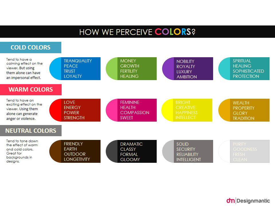
To produce an all-around attractive and eye pleasing image it is imperative that the colors that are used in it are well selected, complement each other and blend together, so that the result is at its aesthetic best. To make it easier for the designers, the colors have been categorized as Warm colors, Cold colors Neutral colors, and dark and light colors.
WARM COLORS: Beige, yellow, orange, pink, red and similar; these are active, eye-catching colors with a friendly nature that may induce a sense of courage and energy.
COLD COLORS: Lavender, silver, azures add subtlety, and convey beautiful aesthetics as well as freshness. Such cold but bright tones enhance a sensation of modernity and professionalism when combined harmoniously with gray. It is a nice composition for businesses, commerce, and service websites, especially, with health, cosmetic and medicine products.
NUETRAL COLORS: White, grey and black help to create contrasts and bring all the other colors out. They don’t convey any particular message on their own. Neutrals are there to support their neighbors by playing the role of complementation on designs. Their use can be truly universal as they work well in a variety of applications.
The Color Impact:
Observing the effects colors have on each other is the starting point for understanding the relativity of color. Different colors used in different situations inspire varying reactions in people all around the world. For example, the color Black is the color of mourning in almost all the cultures of the world. However, white is considered as a color of purity and chastity in the west, but in India, white is a color of mourning. In China, a Green hat may mean that the wife is cheating on the husband! That is how deeply the colors get associated with the items on daily basis, and this is why choosing the perfect color to accompany your brand logo is so important.
There are many generalized categories which are pre-dominant in the branding of a company’s logo, depending on the field that your business belongs to. For example, Yellow is considered as a happy color universally, but the comic book character Green Lantern was afraid of the color Yellow. Red is always all about youth and energy and power, often combined with Love and deep affections. Consumers get attracted to red more than other colors, especially, if the product is one to inspire similar feelings, like Coca cola, McDonalds, KITKAT, Target, Ace, KFC, etc. Orange is about cheerfulness and confidence, Blue belongs to stability and competence, whereas, Green denotes health and life growth. Purple stands for imaginative and wise ‘different’ ideas, and neutral colors are there to show their dependability, their sense of calm and balance.
Such colors dominate the industries today when you see the Apple Company’s logo done in Silver to show their trustworthiness, and all the technology related products being advertised by Blue, like Facebook, IBM, DELL laptops, Twitter logo, Tumbler logo, HP, Intel and so on. Just like Animal Planet has its logo done in green to emphasize its earthiness, and Barbie is Done in Purple to show how different it is, Subway shines in Yellow to project the feeling of happiness that the consumer is sure to feel after experience; colors play an immense role in the building of a brand image.
What Can You Do, And What You Just Can’t!
There are certain colors and shades that just do not mix together. Aside from the fact that you use the perfect color that signifies your message behind the brand that not only embodies the essence of your product; it is also a strong choice.
The simplest set of colors expresses thoughts without words and influences the audiences. The choice of these colors should reflect the brand mission with strength and clarity, so that it can attract prospective customers. If you rely on personal choice and end up creating a garish image where everything clashes and there is too much contrast, then the risk you take is too high, for you may have turned away potential customers who thought your product was a bit too much or too ugly. When selecting the color for your logo, the 10 commandments of color Theory should be well-kept in mind.
You can use colors in tertiary formation, or use the complementary colors, or analogous colors, but you need to make certain that the particular colors, according to the target market’s cultures and mindsets, are not being ignored or merged. Red is not always a sign of love, and blue does not always mean sadness.
How important, do you think, colors are in the making and breaking of a business and its branding strategies? Let us know your opinion in the comments.












![[INFOGRAPHIC]: Color your Brand Industry-wisely! [INFOGRAPHIC]: Color your Brand Industry-wisely!](https://www.designmantic.com/blog/wp-content/uploads/2014/03/Mini-Color-Your-Brand-Wisely-Infographic.jpg)
![[INFOGRAPHIC]: The 10 Commandments of Color Theory [INFOGRAPHIC]: The 10 Commandments of Color Theory](https://www.designmantic.com/blog/wp-content/uploads/2014/05/Color-Theory-Infographic.jpg)
